DQLEditor and CodeEditor: actions, diagnostics, and smarter autocomplete

The latest Strato release ships a significant set of improvements to DQLEditor and CodeEditor. DQLEditor gets a new built-in actions menu, code folding and richer autocomplete suggestions. Both editors gain folding improvements, visible inline diagnostics, along with improved DQL syntax highlighting. Read on for what's new and how to integrate it.
Actions menu
DQLEditor now ships with a built-in <DQLEditor.ActionsMenu /> subcomponent. When added, it renders a menu with three built-in actions — Copy query, Format query, and Open documentation. Format query is also available as a keyboard shortcut (Cmd+Shift+F on Mac, Ctrl+Shift+F on Windows) whenever the editor is focused.
Note: The Format query action requires
@dynatrace-sdk/dqlintas a peer dependency. The option is only present when this package is installed.
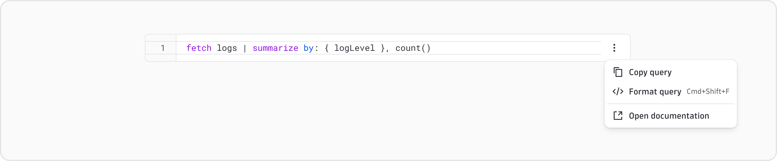
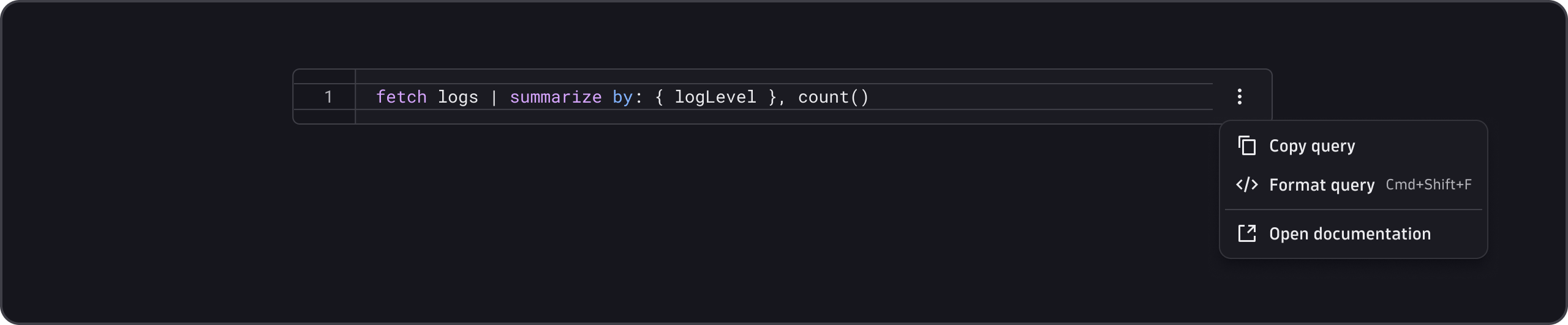
Add custom actions
You can add your own menu items between the two built-in groups. Pass custom action items as children to <DQLEditor.ActionsMenu />:
import { DQLEditor } from '@dynatrace/strato-components/editors';
import { Menu } from '@dynatrace/strato-components/navigation';
import { AiIcon, PlayIcon } from '@dynatrace/strato-icons';

<DQLEditor defaultValue="fetch logs | limit 10">
  <DQLEditor.ActionsMenu>
    <Menu.Item
      onSelect={() => {
        /* your logic */
      }}
    >
      <Menu.Prefix>
        <AiIcon />
      </Menu.Prefix>
      Explain query
    </Menu.Item>
    <Menu.Item
      onSelect={() => {
        /* your logic */
      }}
    >
      <Menu.Prefix>
        <PlayIcon />
      </Menu.Prefix>
      Execute query
    </Menu.Item>
  </DQLEditor.ActionsMenu>
</DQLEditor>;
Smarter autocomplete
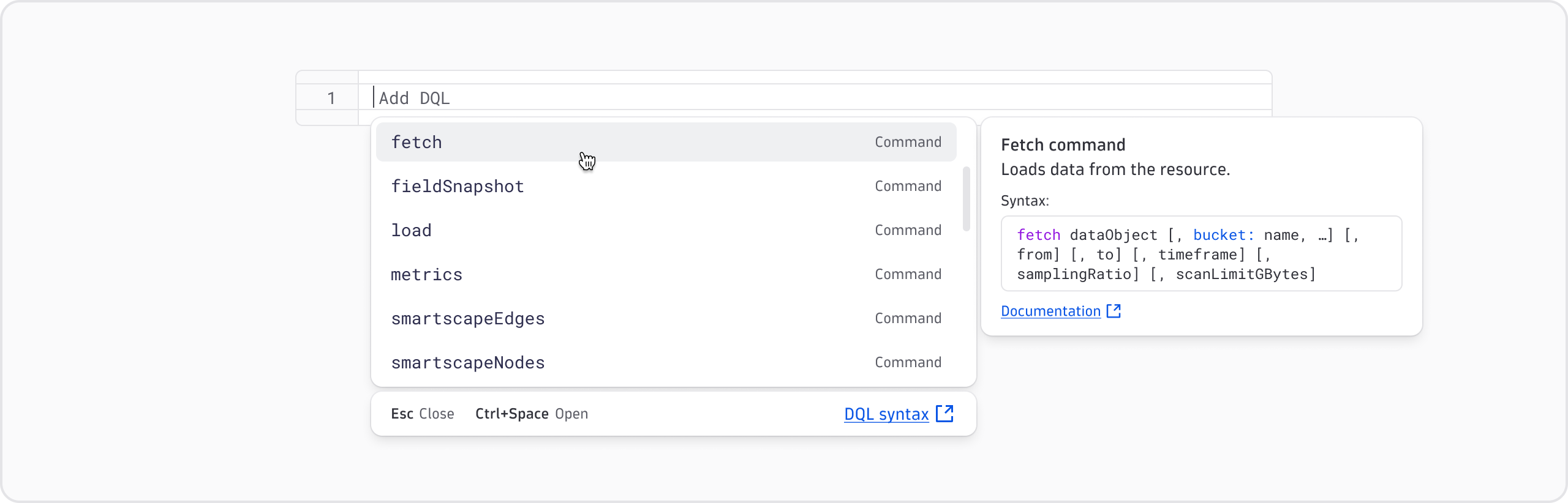
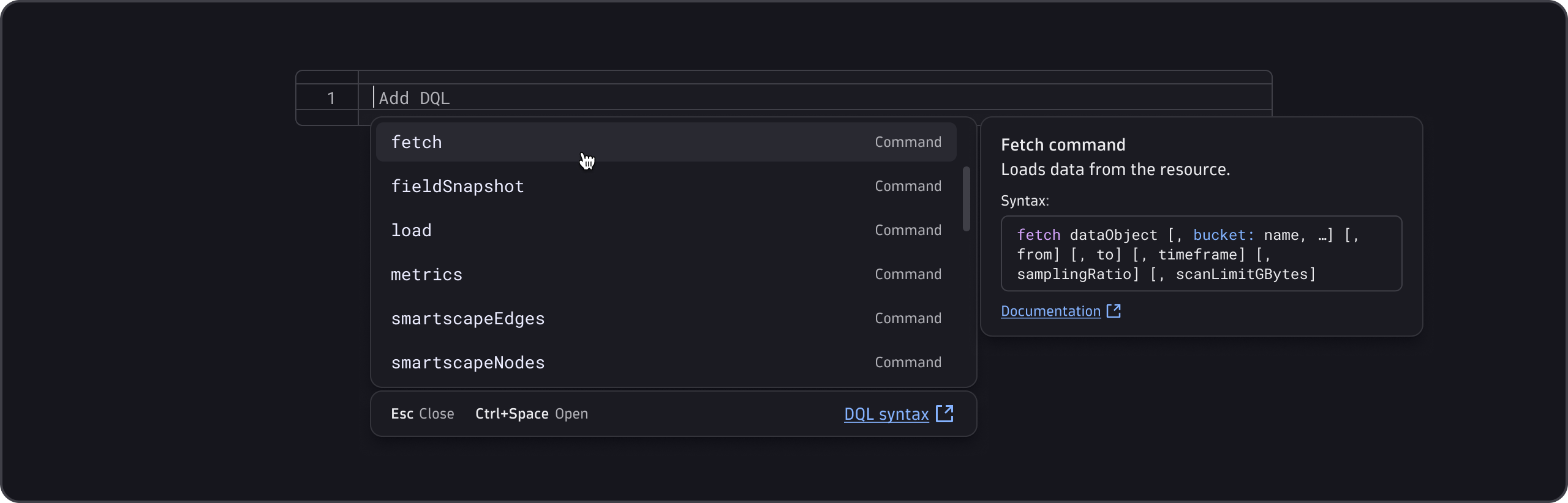
DQLEditor's autocomplete panel now offers richer suggestions:
- Token type labels—each suggestion item now shows its token type (keyword, field, function, etc.) so users can tell at a glance what they're selecting.
- Hover tooltips—hovering a suggestion opens a tooltip with a description and a documentation link. The tooltip layout has been redesigned for readability.
- Keyboard shortcut footer—the bottom of the autocomplete panel now shows a footer with keyboard shortcuts and a link to the DQL documentation.
- Smarter auto-open—the panel opens more reliably in the situations where it's useful and stays out of the way when it isn't.
DQL syntax highlighting
Several DQL token types that had no highlighting before now have distinct highlighting:
- Boolean keywords (
true,false) - Numbers and unit tokens (
1h,500ms) - The
nullkeyword - Triple-quoted strings (improved highlight boundaries)
These are automatic. No configuration required.


Code folding
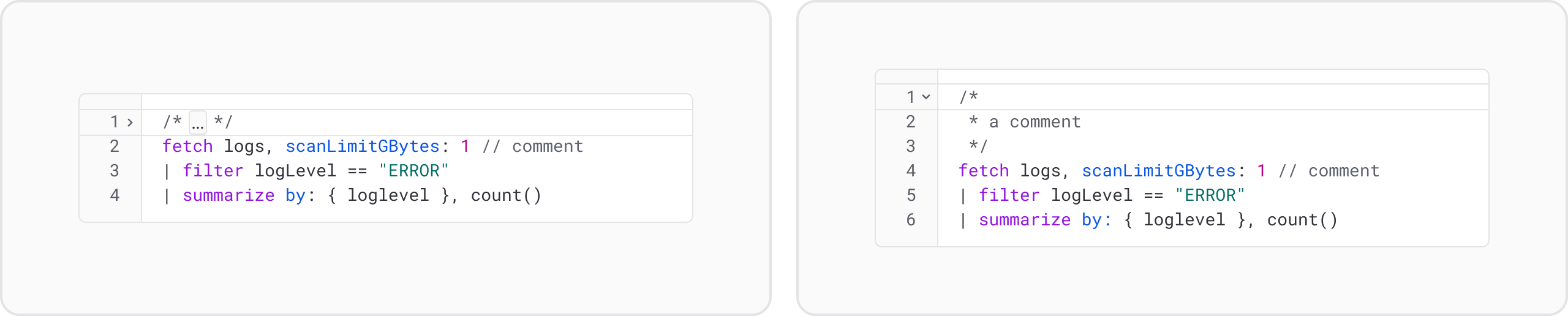
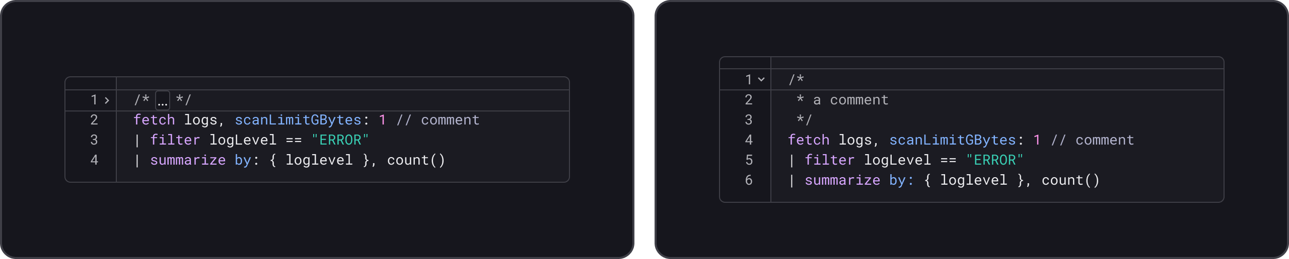
The DQLEditor now supports folding of multi-line block comments (/*…*/) and subqueries ([…]).
Both DQLEditor and CodeEditor expose two folding APIs:
defaultFolding—pre-folds specific blocks on initial render (uncontrolled).folding/onFoldingChange—controlled folding that lets you programmatically fold or unfold blocks from outside the component.
Inline diagnostics and lint gutter
CodeEditor now surfaces validation errors directly in the editor. There's no need to rely solely on a separate validation message below the component.
Set the showLintGutter prop to show severity icons (error, warning) next to the affected line in the lint gutter (the narrow margin column on the left of the editor).


Add diagnostics in CodeEditor
CodeEditor accepts a new diagnostics prop of type InlineDiagnostic[]:
import { CodeEditor, type InlineDiagnostic } from '@dynatrace/strato-components/editors';

const code = 'const count: number = "hello";\nconst result = 42;';

const diagnostics: InlineDiagnostic[] = [
  {
    from: 22,
    to: 29,
    severity: 'error',
    message: "Type 'string' is not assignable to type 'number'.",
  },
  {
    from: 37,
    to: 43,
    severity: 'warning',
    message: "'result' is declared but its value is never read.",
  },
];

<CodeEditor language="ts" defaultValue={code} diagnostics={diagnostics} showLintGutter />;
The lint gutter for CodeEditor always shows all diagnostics.
CodeEditor supports off-screen diagnostic indicators: floating pills at the top and bottom edges of the editor that flag errors outside the visible viewport. Set showOffScreenDiagnosticIndicators to true to enable them.
ValidationState API for CodeEditor
You can now wire CodeEditor into a Strato form for validation. Add name and required props and wrap it in a FormField. The editor wires itself into native form submission automatically, including built-in linter errors (JSON syntax, for example) as part of the validity state.
Use onValidityChange to subscribe to validity changes. It fires on blur and whenever the linter settles, giving you a ValidationState with status, trigger, and any errors. To trigger validation programmatically, for example from a submit button, call ref.current.validate(), which waits for the linter to finish before resolving.
import { CodeEditor } from '@dynatrace/strato-components/editors';
import { FormField, FormFieldMessages, Label } from '@dynatrace/strato-components/forms';
import type { ValidationState } from '@dynatrace/strato-components/forms';

<FormField>
  <Label>JSON configuration</Label>
  <CodeEditor
    name="config"
    language="json"
    required
    onValidityChange={(state: ValidationState) => console.log(state)}
  />
  <FormFieldMessages />
</FormField>;
Proper controlled and uncontrolled handling
In earlier versions, the Strato editors didn't cleanly support the standard controlled and uncontrolled React patterns. Now, both Strato editors accept an isControlled prop to enable the standard React behavior. Existing code without the prop continues to work as before. The new behavior will become the default with the next major release. For details, see the DQLEditor and CodeEditor documentation.
Accessibility
This release includes improvements toward WCAG 2.2 AA:
- Fold markers are hidden from the accessibility tree so screen readers aren't interrupted by gutter controls.
- The DQL autocomplete info section now announces updates to screen readers.
Getting started
Update your Strato packages to pick up these improvements:
npm install @dynatrace/strato-components@latest
Tip: Check the Strato changelog for the exact version and any migration notes.
For full API references, see the updated component docs: