More vibrant, more structured, less gray: Strato's fresh, new look is here

The Strato visual refresh has rolled out. If you build apps for Dynatrace, your UI now looks cleaner, calmer, and more modern—without a single line of code changing on your side. The goal we set at the start was simple: clearer structure, less gray, and more vibrant colors. Here's what changed:
A page layout built on lines, not stacked surfaces
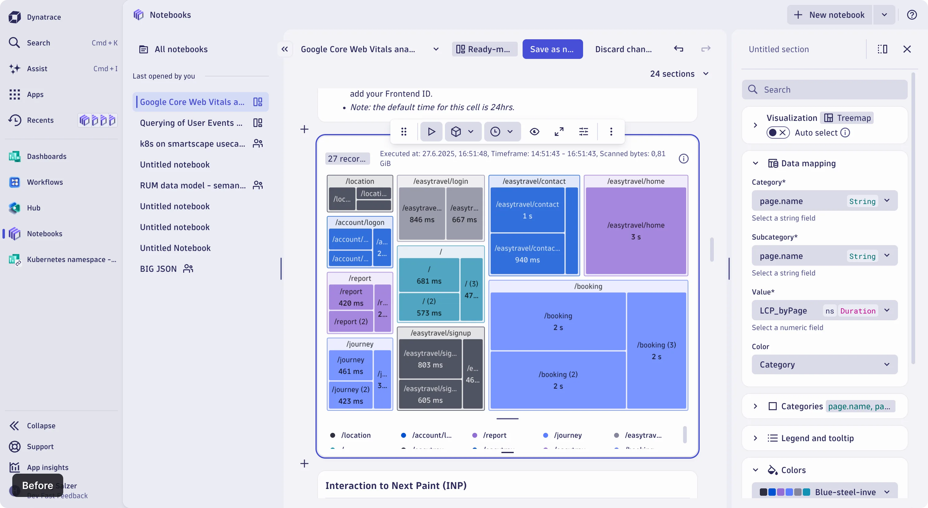
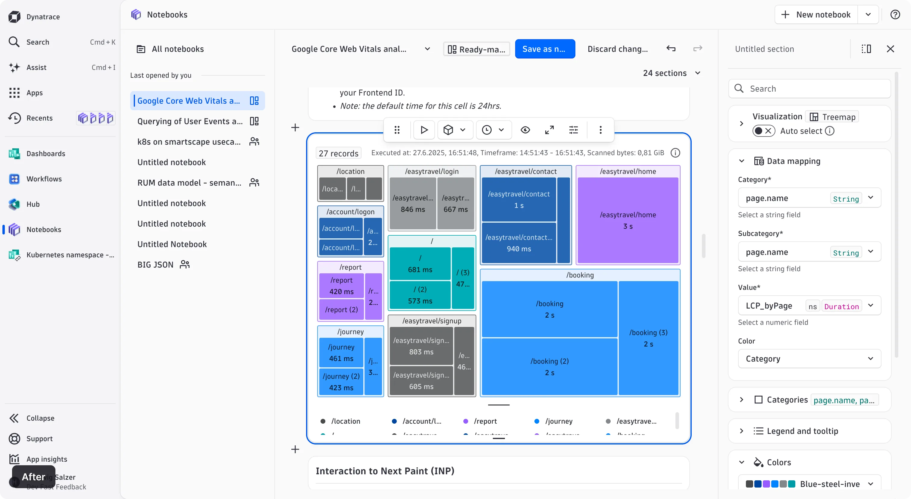
This is the change you'll feel the most. Page structure used to come from nested surfaces; it now comes from lines. Sidebars, detail panels, and content regions sit flush on the page background, separated by thin dividers.
Surfaces are still there, doing the job they're best at: grouping related content rather than carrying the page structure. With structure coming from alignment and dividers, instead of stacked backgrounds, the interface is calmer, dense pages are easier to scan, and a surface now genuinely means "these things belong together."
More vibrant colors, cleaner grays
Status colors are cleaner and brighter. Success, warning, and critical are now noticeably more saturated, so a critical alert reads as urgent, at a glance, and a success state shows the confidence it should.
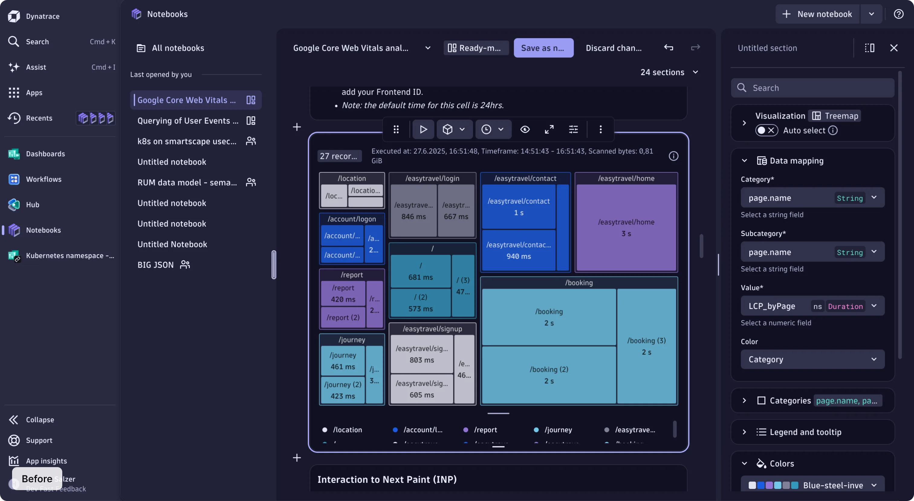
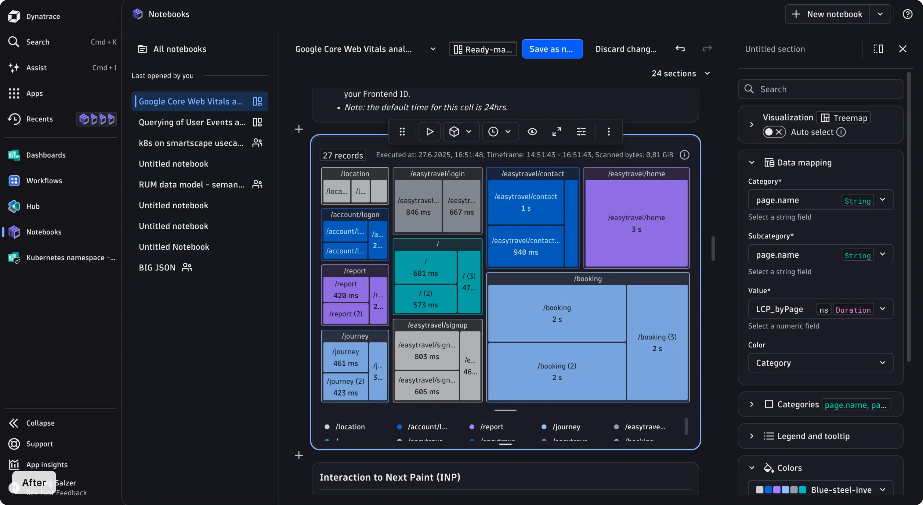
The gray shades were rebuilt too. The whole neutral scale was regenerated from scratch, which removes the general grayness that was there before. Dark mode changed from heavy blue-gray to a more neutral and readable coloring.
Dark mode now follows the same elevation logic as light mode: the higher an element sits, the brighter it is. Depth reads identically in both themes, so a raised panel or a floating menu is recognizable at a glance, and dense pages stay calm and easy to scan.
Fields that read as interactive
Fields are now outlined and bright rather than filled. An empty field reads immediately as somewhere you can enter text, and a form full of different fields feels lighter and uncrowded.
Gray now does a more specific job. Read-only and disabled fields keep a gray background, which makes those states unmistakable at a glance. Now, gray reliably means "you can't edit this." Chips follow the same rule, trading solid blocks for outlines.
Refreshed chart colors
Chart colors followed the UI refresh with the same intent: more vivid, more distinct. The sequential palettes were rebuilt using the OKLCH color system, a perceptually-uniform model where equal numerical steps look like equal steps to the eye. All the other palettes are derived from these new shades.
The mid-range shades keep their full saturation now, so overlapping chart series stay visually distinct even in dense charts. Charts across dashboards, notebooks, and custom apps all pick up the new colors automatically thanks to the Strato design tokens.
More chart palettes are on the way, including a vivid categorical set and several themed palettes.
Before and after
Before
After
What this means for your app
Nothing to migrate. The refresh ships through Strato's design tokens, so any component you already use picks it up automatically without API changes, and no breaking changes either.
If you style anything yourself, design tokens are what save you here. Token references resolve to CSS custom properties, so anything built on them moved along with the rest and is already up to date.
The spots worth a close look are hardcoded values: anywhere a color or style was written literally to match Strato by eye, instead of referenced from a token. Those didn't move, so they may now sit slightly out of step.
The refresh is live now, across every Strato app your team already ships. Take a look at your apps today, and if something looks off, let us know through the Feedback button at the bottom of this page.