AvatarGroup
The Avatar component can be used as a visual representation of multiple users.
When to use
- To display several users together in a limited space, such as a list of collaborators, assignees, or participants.
- When a compact, at-a-glance view of a group is sufficient and tooltips can identify each person.
When not to use
- To represent a single user. Use Avatar instead.
- To represent non-person entities such as objects, hosts, or services. Use the corresponding functional icon instead.
Content guidelines
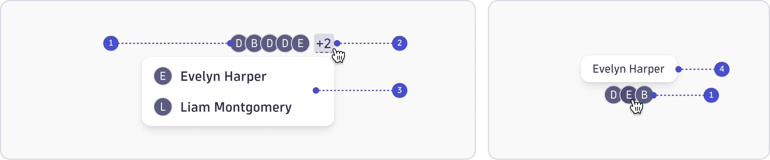
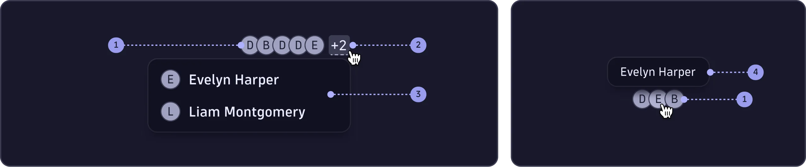
- Avatars (required)
- Overflow menu trigger (only when there are +5 avatars)
- Overflow menu (only when there are +5 avatars)
- Tooltip (required)
Avatars
- Each avatar displays the user's initials and follows the
Avatarcontent guidelines.AvatarGrouponly changes how avatars are arranged, not how each one is written.
Overflow menu trigger
- When there are more than five avatars, the remaining users are collapsed into an overflow menu.
- The trigger shows the count of hidden users (for example, +3).
Overflow menu
- List each hidden user by their full name.
Tooltip
- Provide a tooltip for each avatar, since items in a group don't show a label.
- Only include the user's name in it.