EmptyState
Use the EmptyState to communicate that no data is available for a section or
view and guide users toward resolving the situation with a clear title,
description, and actions.
When to use
- The user hasn't created anything yet.
- The user hasn't configured a setting or feature yet.
- A search, filter, or query returns no results.
- The system can't load data due to an error.
- The user has no access to the app or its data.
When not to use
- Existing content is still on screen and an action only failed. Use Error messages instead.
- The state is temporary, such as loading or saving. Use the Loading and saving pattern.
- When a single action is blocked, such as a disabled control for which the user lacks permission.
Anatomy
Not every empty state needs all its elements. Pick the combination that fits your context. See Sizes for what to include per size.
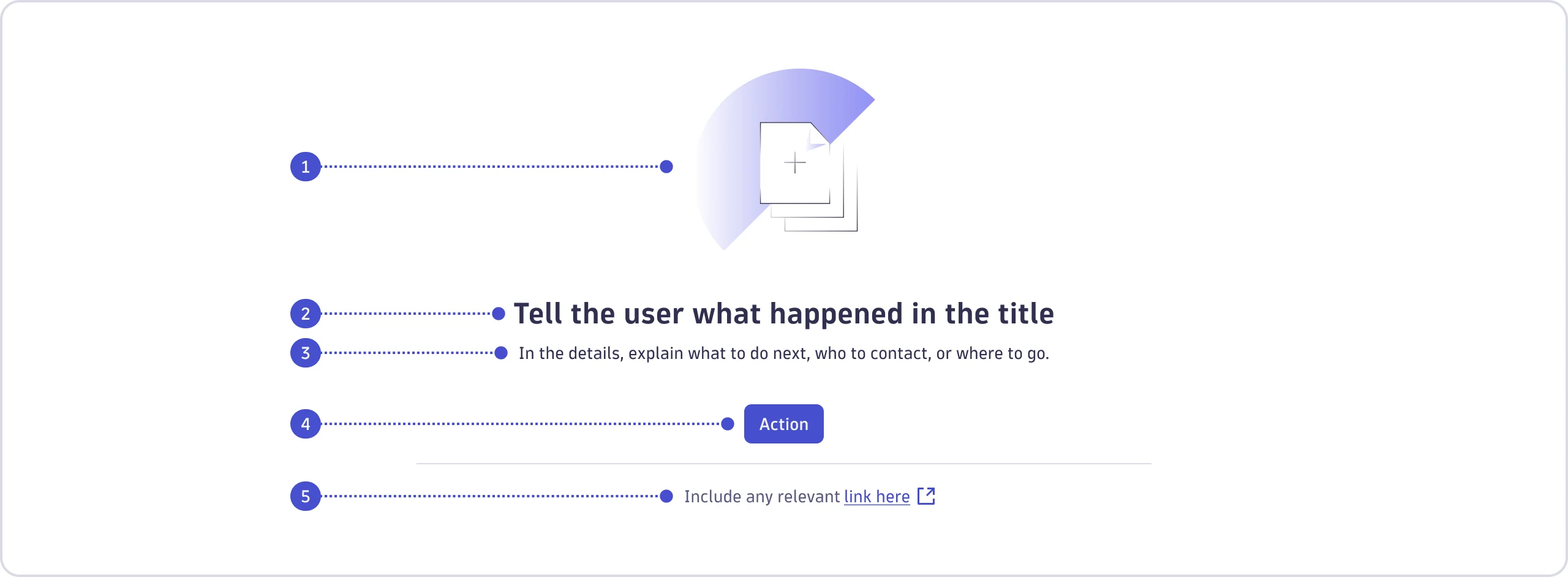
- Visual
- Title
- Details
- Action
- Footer
Sizes
Choose the component size based on where the EmptyState appears and how much
space it takes.
| Component size | When to use | Example | Included elements |
|---|---|---|---|
| Hero (large) | Fills the entire page |
|
|
| Default (medium) | For a distinct section within a page |
|
|
| Small | Fits into a tight or dynamic space |
|
|
Content guidelines
Write in a calm, direct tone. The user has hit a dead end, so the copy should point them forward without making them panic.
- Use sentence case throughout.
- Use common contractions ("isn't" rather than "is not").
- Don't make the user feel responsible for the empty state.
- Don't be overly apologetic. Phrases like "Sorry, nothing here!" add noise without helping.
Visual
- Use the
VisualPresetslot to add a contextual illustration.- Set the
type—the reason the state is empty—first:something-missing(question mark),no-result(empty circle),something-wrong(cross),create-new(plus),no-permission(lock). See Use cases for more details. - Then, set the
context—what would normally appear in that area:generic,document,table,chart,query(e.g.,chartfor a chart area;genericwhen it's uncertain or mixed).
- Set the
- When using the small component size inside a section, tile, or panel, prefer
an icon over an illustration, as illustrations can feel heavy in tight spaces.
Skip the illustration in search or filter views, where the
EmptyStatecan appear and disappear as the user types. An illustration is still appropriate when a smallEmptyStatefills an entire view, such as when no item has been selected yet.
Title
In a few words, tell the user what's missing or what state is in effect.
- Don't add punctuation at the end.
- Don't open with an apology or vague exclamation.
| Do | Don't |
|---|---|
| No matching logs | Oops, there's nothing to show here! |
Details
In one or two sentences, explain what the user can do next. If there's no action available, tell them who to contact or where to go.
- End with a period.
- Don't repeat the title.
- Lead with the action or next step, not a restatement of the problem.
| Do | Don't |
|---|---|
| Try changing the keywords or clear your search. | Sorry, no logs match your search. |
Actions
Keep the label to one or two words, starting with an imperative verb. Learn more about the Button component.
- The label should describe the action the user will take.
- Omit the button:
- If no action is available.
- In a no-result state; guide the user to adjust their query instead and consider adding a "Clear filters" or "Clear search" button.
| Do | Don't |
|---|---|
| Upload file | Continue |
Footer
Include a footer only when a documentation link or support article is genuinely useful. Don't add one by default. See Links.
| Do | Don't |
|---|---|
| Learn more about log ingestion | Learn more |
Use cases
Each use case maps to one illustration type. The elements you include depend
on the component size. Refer to Sizes for what's recommended, or
optional, and what to avoid depending on the size.
Create new
The user visits for the first time and hasn't created anything yet, or needs to add, upload, or select an item.
Recommended content structure
- Visual—pick the illustration that matches what would normally appear
here:
generic,document,table,chart, orquery. - Title—name what hasn't been created yet.
- Details—describe what the user needs to create and any relevant requirements.
- Actions—use a context-appropriate label, such as "New" or "Upload".
- Footer—include only if it genuinely helps.
Examples


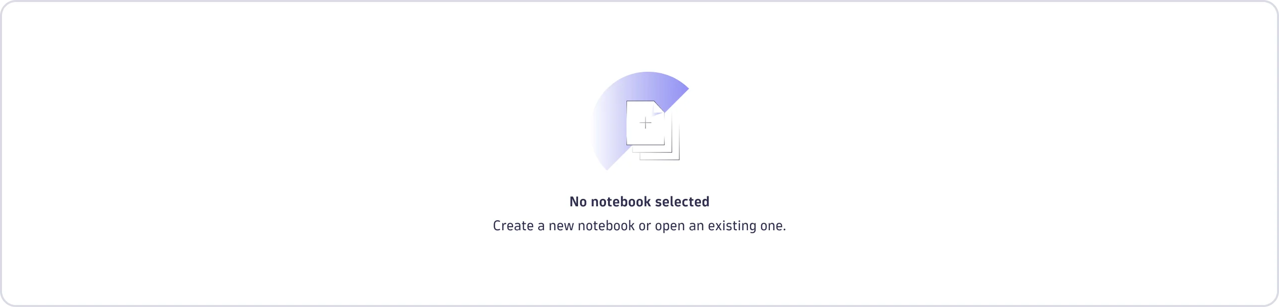

Something missing
The user hasn't configured or enabled a setting or feature, so the data can't be displayed.
Recommended content structure
- Visual—pick the illustration that matches what would normally appear
here:
generic,document,table,chart, orquery. - Title—name what's missing or not yet configured.
- Details—explain how the user can fix it. If there's no fix, give them a way back.
- Actions—add an action if there's something the user can do.
- Footer—include only if it genuinely helps.
Examples




If the small empty state only needs a single line of text with no other
elements, consider using a plain text component instead of EmptyState.
No result
A search, filter, or query returned nothing, or a requested page isn't available (404).
If results are hidden by conditional access rather than a true "no match", apply the conditional-access guidance from No permission. Don't reveal that the data exists.
Recommended content structure
- Visual—pick the illustration that matches what would normally appear
here:
generic,document,table,chart, orquery. - Title—name what the system couldn't find.
- Details—guide the user to adjust their query, filters, keywords, or timeframe.
- Actions—skip the action button. You're already guiding the user to refine their query in the details.
- Footer—include only if it genuinely helps.
Examples




Something is wrong
The system couldn't load data due to an error, either identifiable or unknown. Use this when the error leaves a section or component with nothing to show. If existing content is still visible, or the error needs to surface alongside the UI, refer to Error messages to choose the right component.
Recommended content structure
- Visual—pick the illustration that matches what would normally appear
here:
generic,document,table,chart, orquery. - Title—say what went wrong.
- Details—include an error code and a recovery step. If there's no fix, give the user a way back.
- Actions—let the user go back or try again if no better action is available.
- Footer—include only if it genuinely helps.
Examples




No permission
This use case covers two situations.
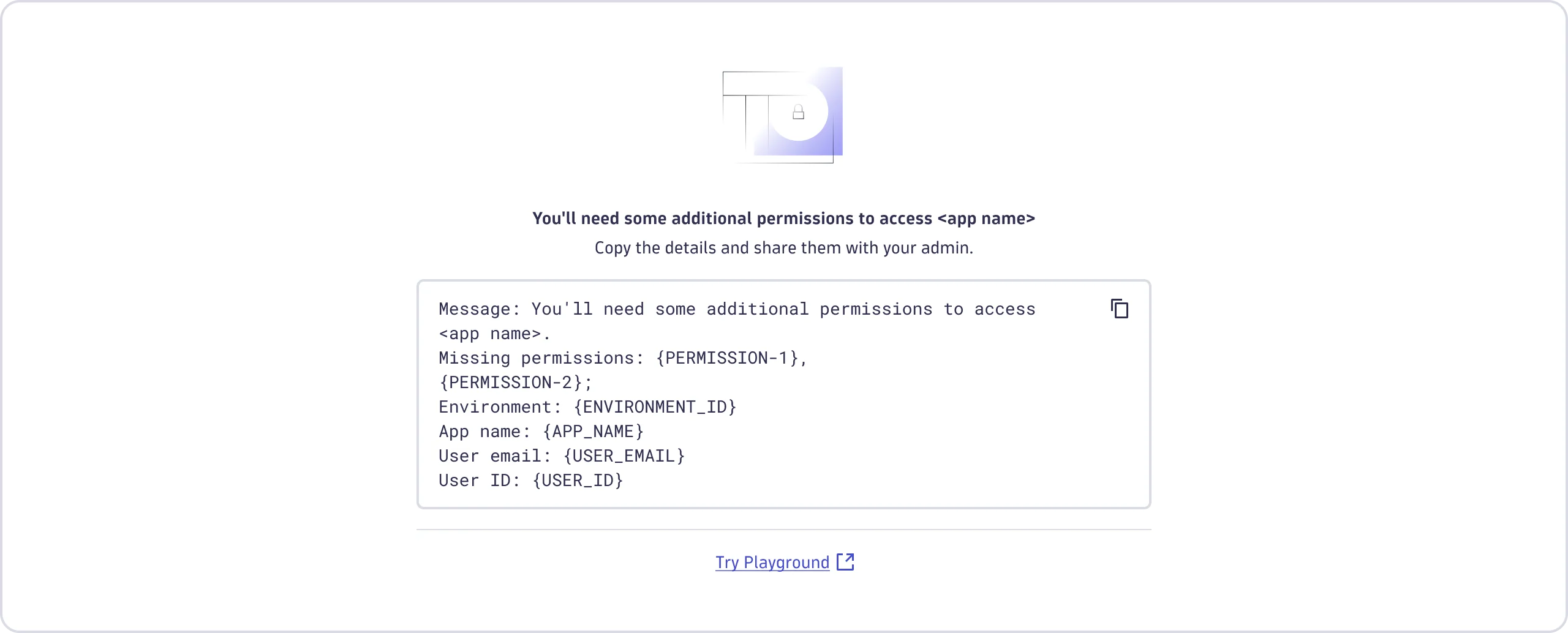
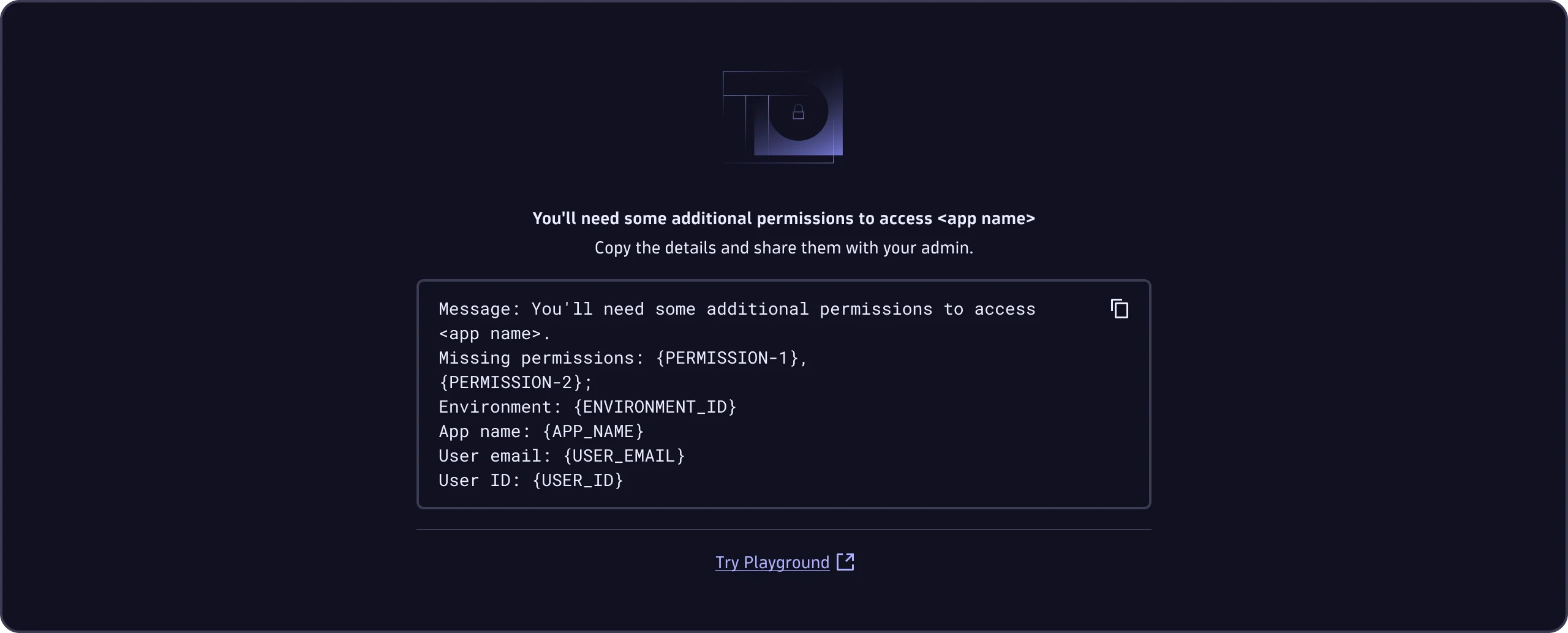
- Full denial (no access to the app or its core data)—Use
no-permission. Show "You'll need some additional permissions to access <app name>" with copyable details and a "Try Playground" link. - Conditional access (data exists but a condition hides it)—Use
no-result, notno-permission. Show "No <entity> available", and never reveal that the data exists.