DataTable
Use DataTable to display and manage datasets with rich interactions such as
sorting, filtering, pagination, and row selection.
When to use
- When users need to sort, filter, paginate, or interact with large or complex datasets.
When not to use
- For a purely visual representation of tabular data without significant interactivity such as sorting or pagination. Use SimpleTable instead.
Visual configuration
DataTable supports configuration for its visual look, data density, and data
point separation.
Container
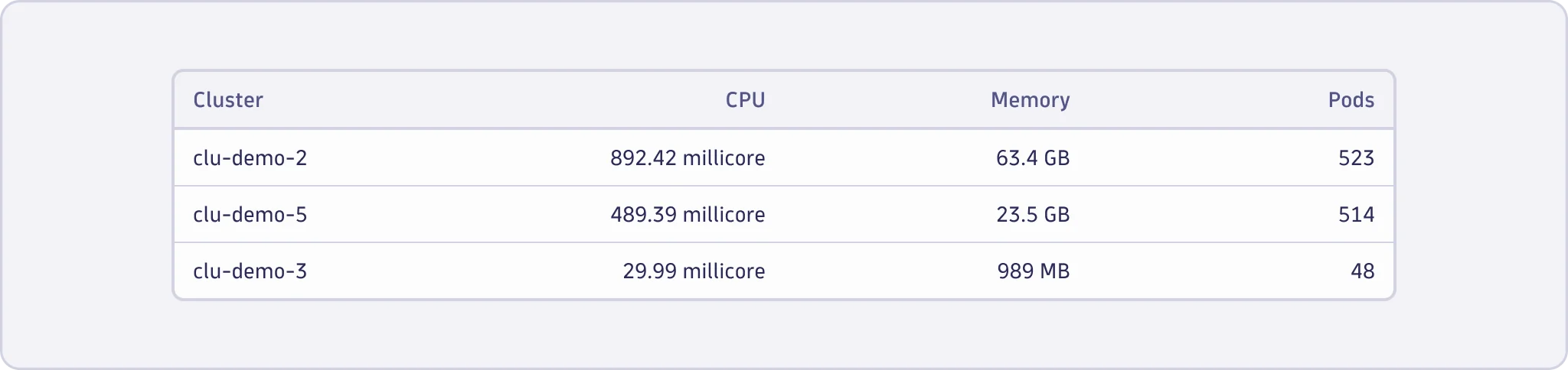
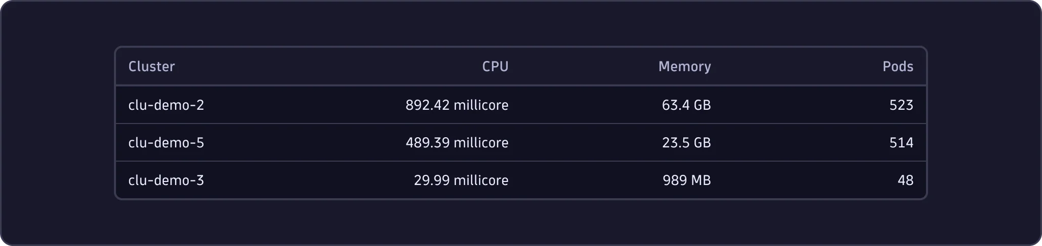
Contained
- Use the contained variant for most cases, and especially if it is prominent in the visual hierarchy of the view.
Uncontained
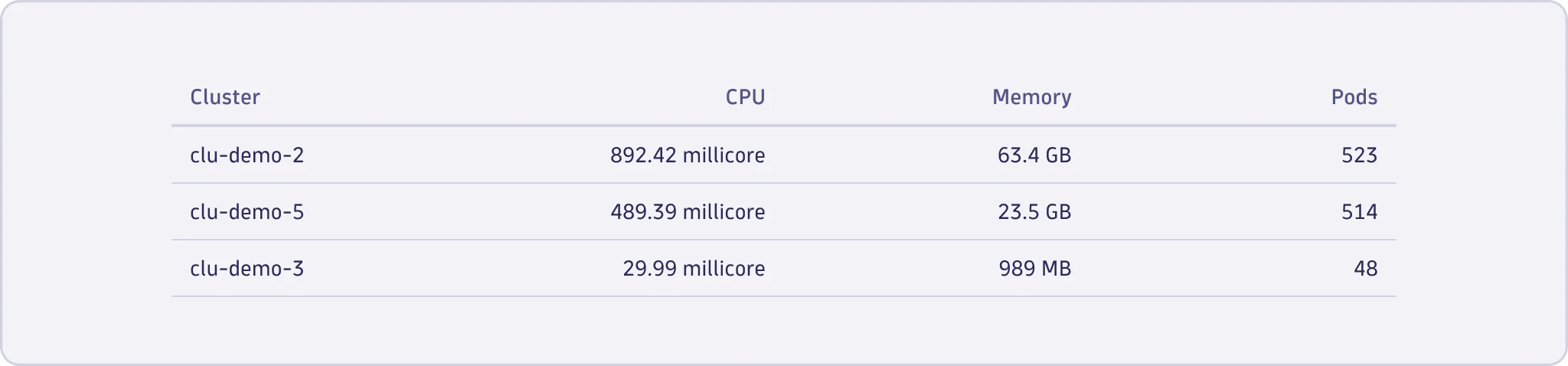
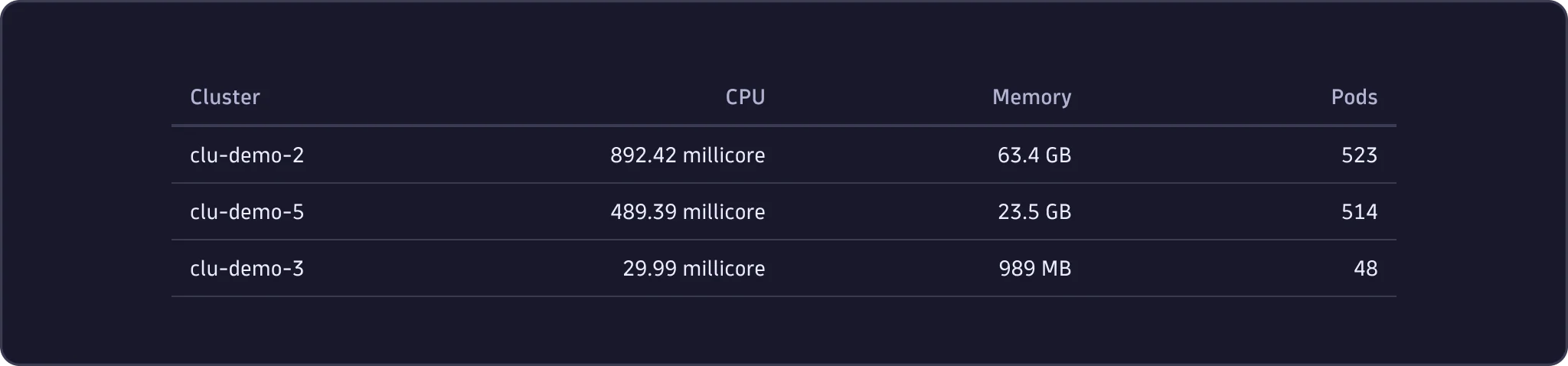
- Always use the uncontained variant when it's the only element inside a
Surface. - Use for a subtler appearance when the table is secondary in the visual hierarchy of the view.
Data density
DataTable comes with three density options that control the standard row
height and whitespace in a cell.
Default
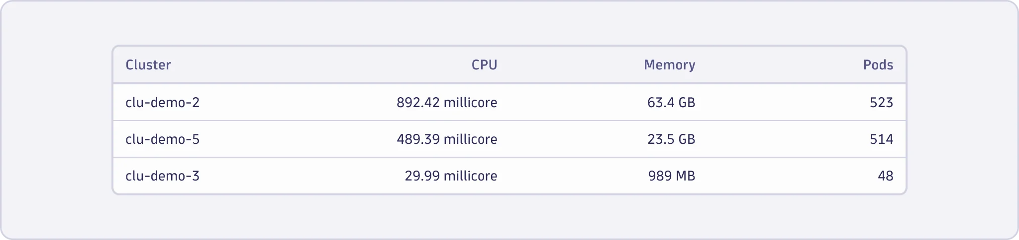
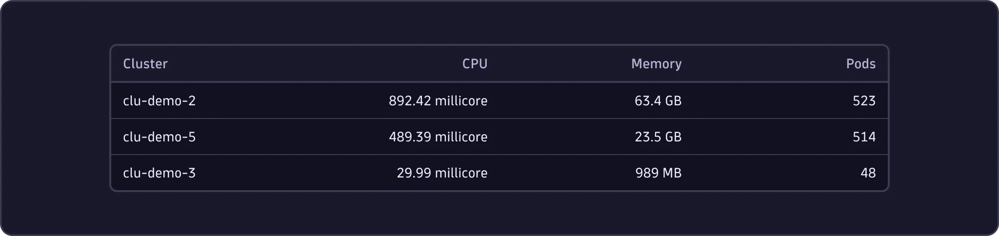
- Use the default row density for datasets where users need to process and scan the information shown.
Condensed
- Use the condensed row density to show more information in smaller areas and compact layouts. Consider that cell content might be more challenging for users to scan and distinguish.


Comfortable
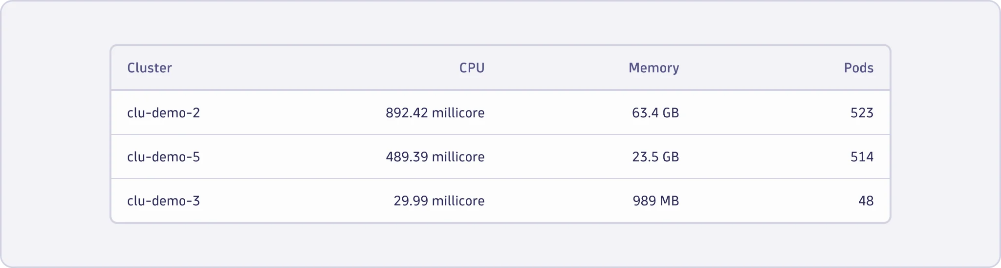
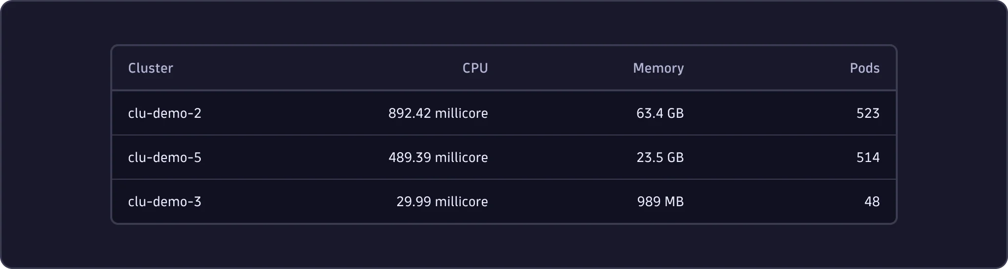
- Use the comfortable row density to improve readability for tables with visually crowded cell content and where extra space will support user experience. Consider that this density setting will show less information in the same area.
Data point separation
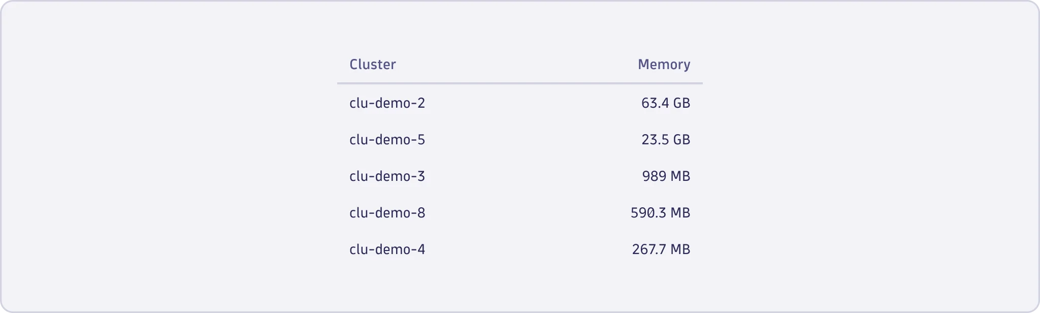
No separation
- Use no visual data point separation for simple data sets, for example, a key-value list.

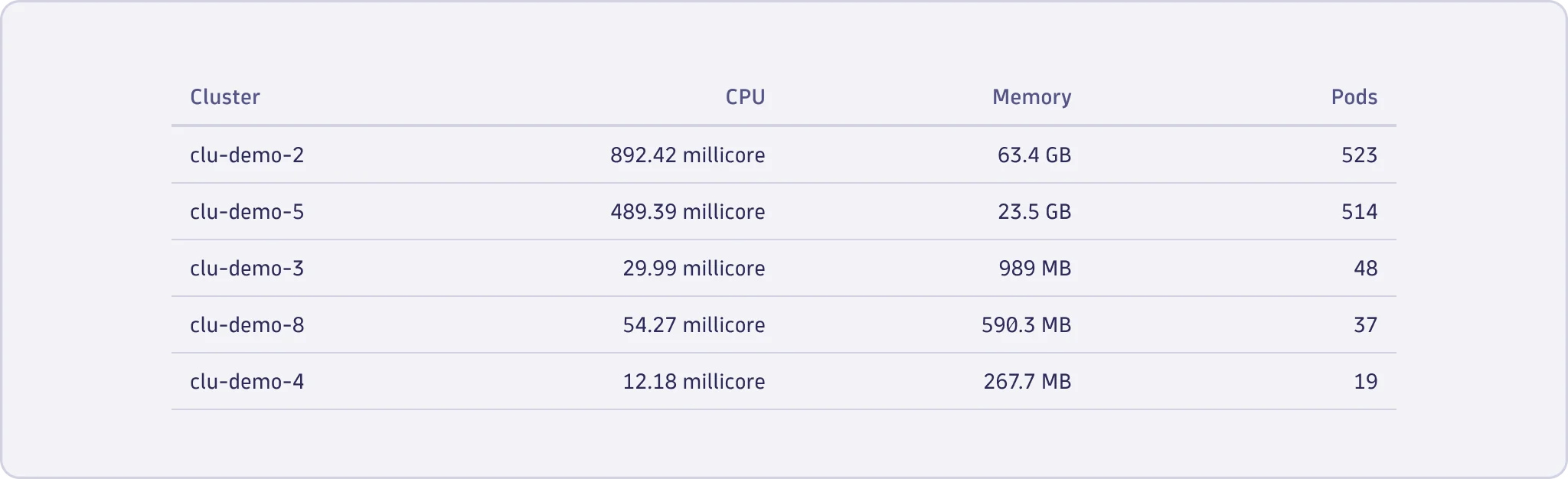
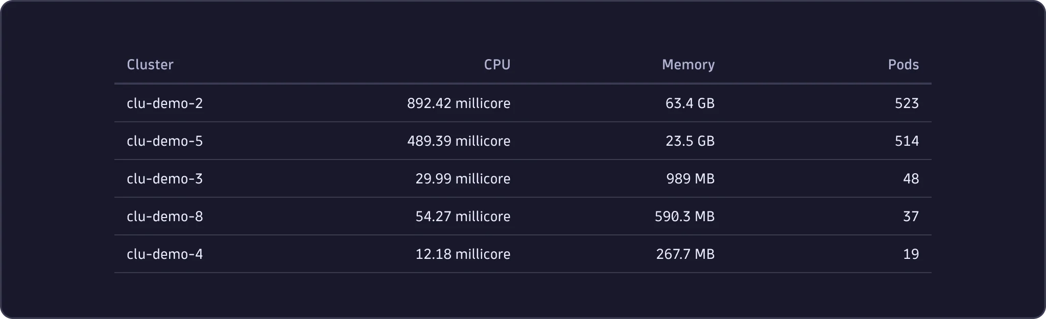
Horizontal dividers
- Use horizontal dividers to highlight the distinction and separation between rows.
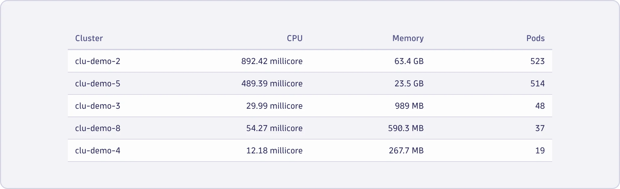
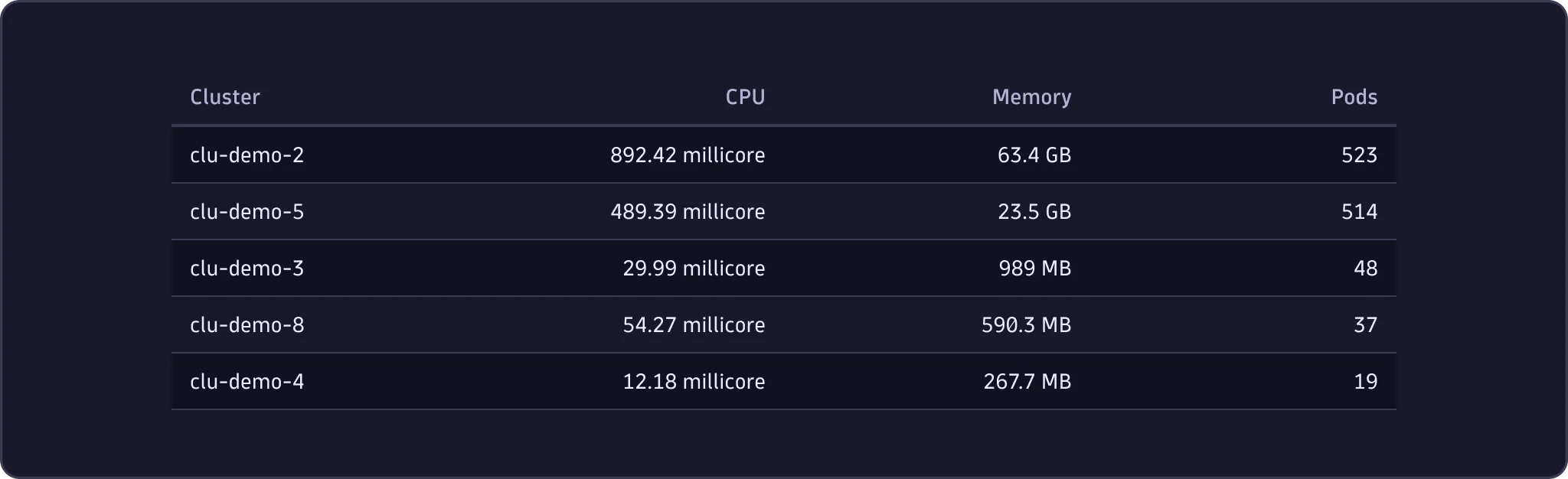
Zebra stripes
- Consider using zebra stripes for large datasets where users may want to interact with one or more data points in the view to ensure easier scanning and distinction between rows.
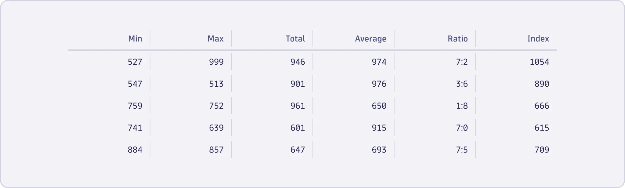
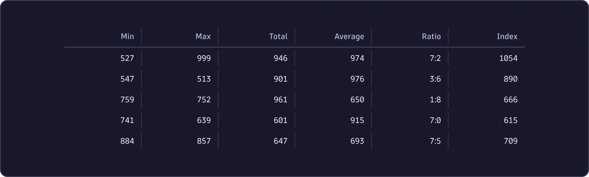
Vertical dividers
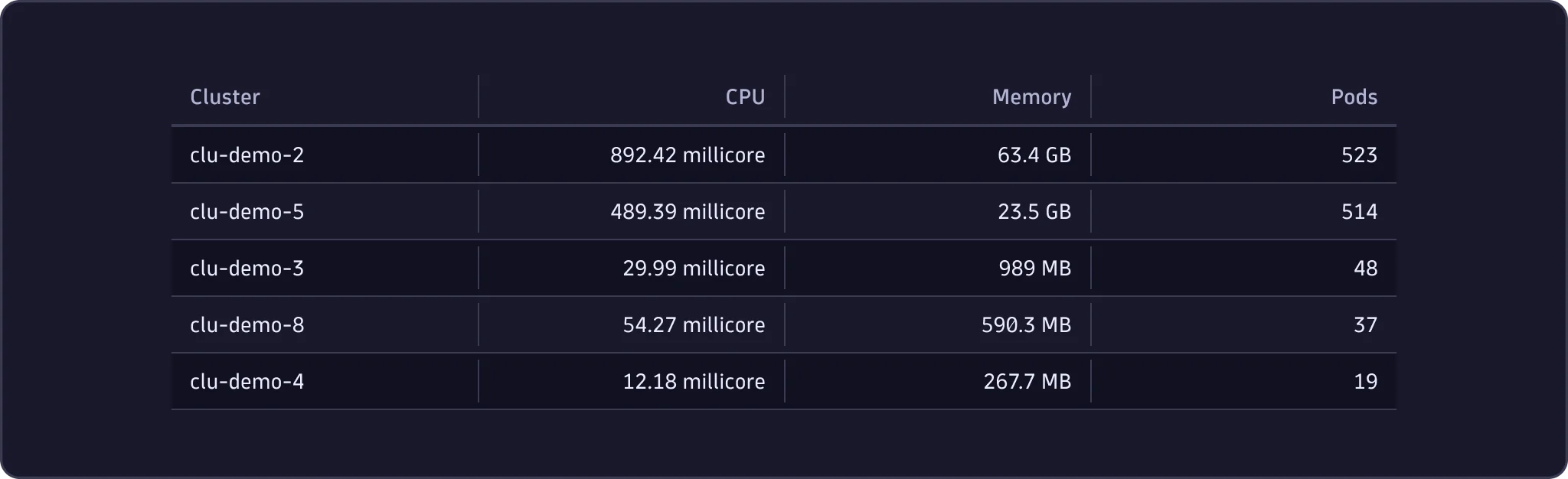
- Use vertical dividers to separate columns, especially when dealing with a relatively large amount of data points.
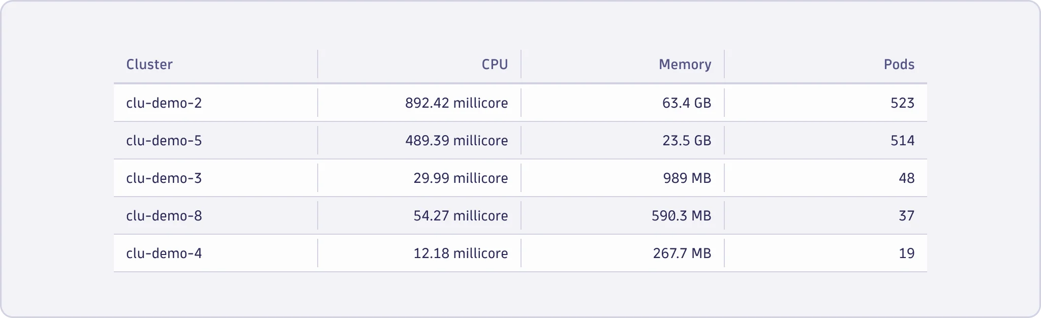
Combined separation
- Combine zebra stripes and vertical dividers to establish a structured dataset, ensuring row and column distinction for effective readability.
Actions
DataTable supports actions at table, column, row, selected
row(s), and cell level. Place each action at the level that matches what
it affects.
Table actions
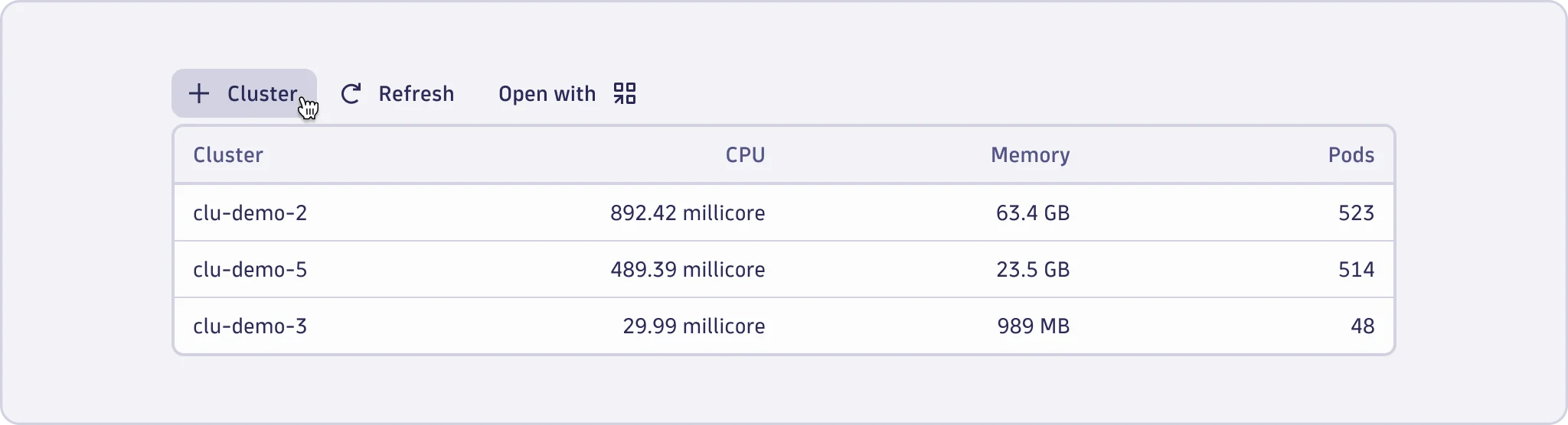
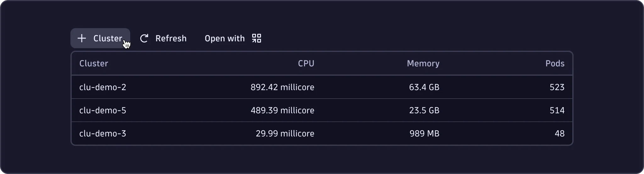
- Use table actions for operations that affect the entire dataset, such as global sorting, filtering, or exporting.
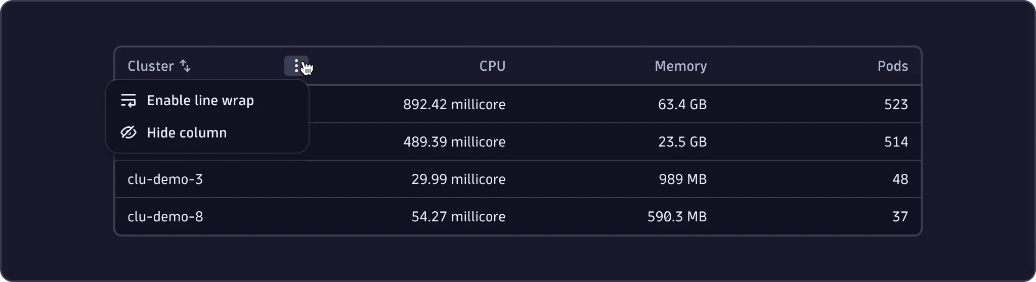
Column actions
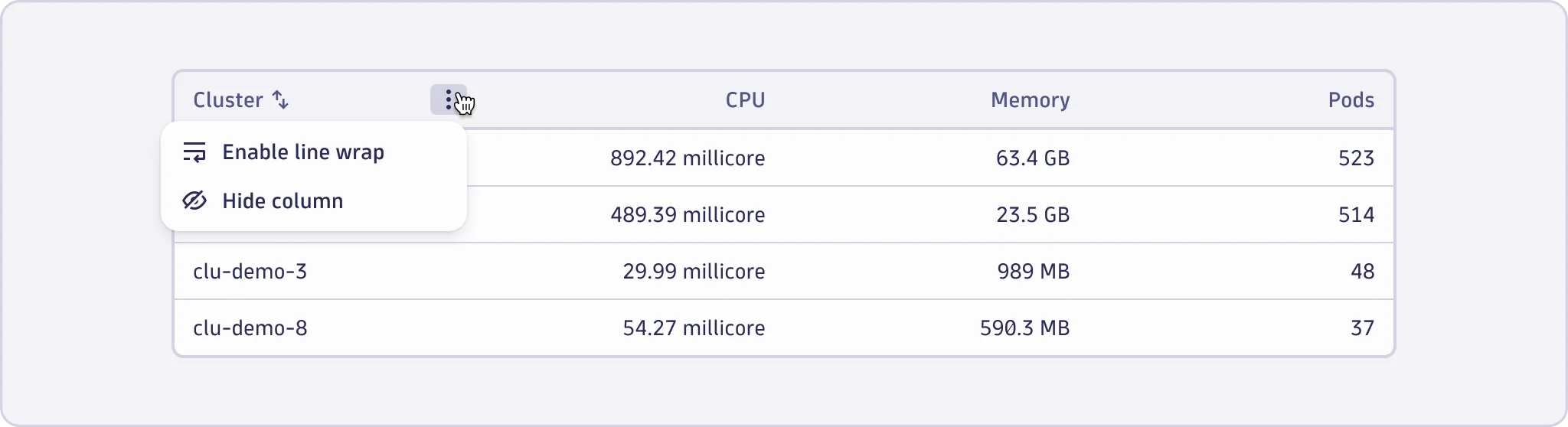
- Use column actions for operations that affect a specific column, such as sorting or column visibility.
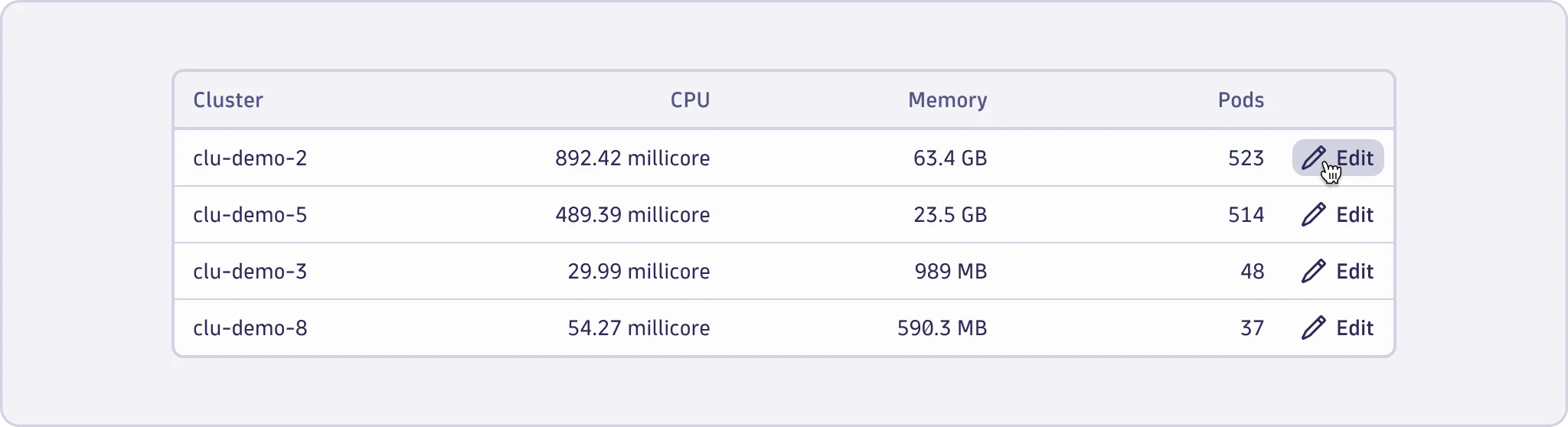
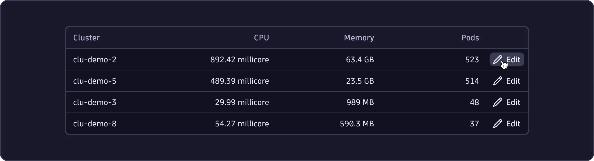
Row actions
- Use row actions for operations related to specific rows, such as "Edit" or "View details".
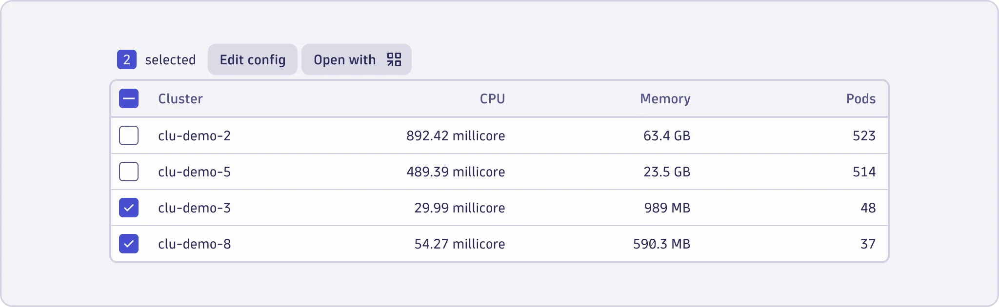
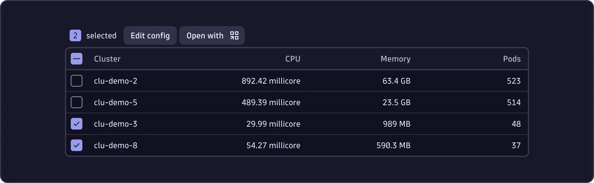
Selected row actions
- Use selected row actions for operations that users can perform on one or multiple selectable rows simultaneously.
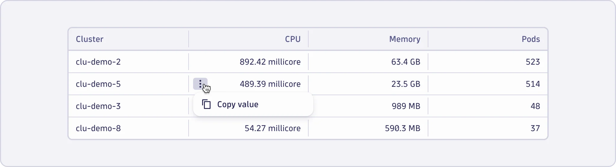
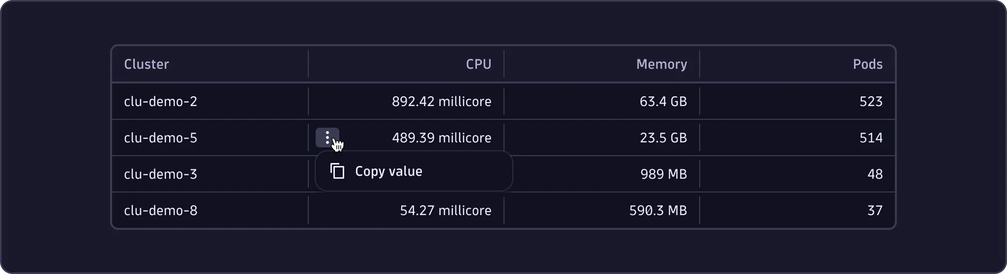
Cell actions
- Use cell actions for operations related to specific cells, such as "Copy to clipboard" or other context-specific activities for a particular piece of data.
Content guidelines
Table actions
- For table actions, refer to the Button content guidelines.
Columns and rows
- Column headers should be one or two simple words and sentence case.
- If the column header is a noun, make it singular.
- Action names can be one to three words. See Common actions for patterns.
Table data
- Display data in a consistent format. Learn more about formatting data.
- Show an empty state when there's no data or there's an error. Learn more about EmptyState.