Mobile experience
- New
- Reference
- 8-min read
Use this mobile experience guide to adapt your app for mobile devices and other smaller screens, or to build a mobile-first app following Strato's design principles.
Getting started
The mobile version of your app should give users the same information as the desktop version does: nothing gets removed, only the degree of optimization changes for a smaller viewport. If your app sends alerts or notifications, be sure to fully optimize the pages those notifications open, since users land there directly. The following table lists criteria to help you prioritize the parts to optimize for mobile:
| Criteria | Ask yourself | Favors full optimization | Favors baseline optimization |
|---|---|---|---|
| Trigger source | Is the feature triggered by something the user receives on mobile? | Page is reached directly from a push notification or alert. | Page is typically entered from desktop. |
| Task urgency | Would delaying the task until desktop access is possible cause harm? | Time-sensitive, can't wait. | Can reasonably wait. |
| Interaction complexity | Does the task require precise pointer input, drag-and-drop, or multiple views? | Simple selections suffice. | Requires precision or complex comparison of different elements in the layout. |
| Information density | Can the content be reflowed for mobile width without losing critical detail? | Reduces cleanly using the patterns in this guide. | Inherently requires desktop-width space or should remain visible via zoom or scroll. |
| Frequency of mobile use | Do users reach for mobile for this task? | Yes, frequently. | Rarely or never. |
Layout
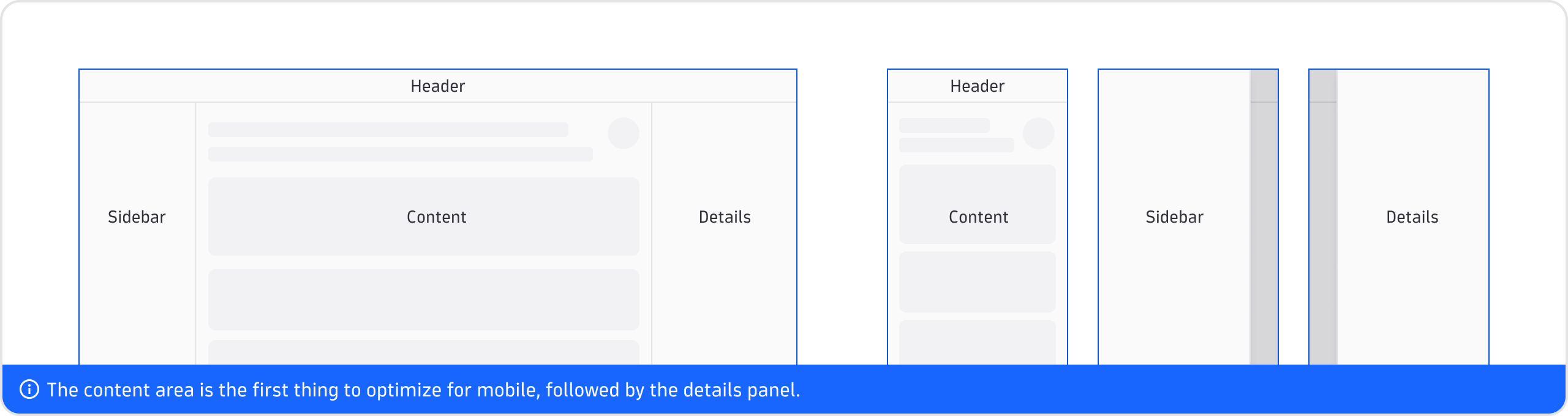
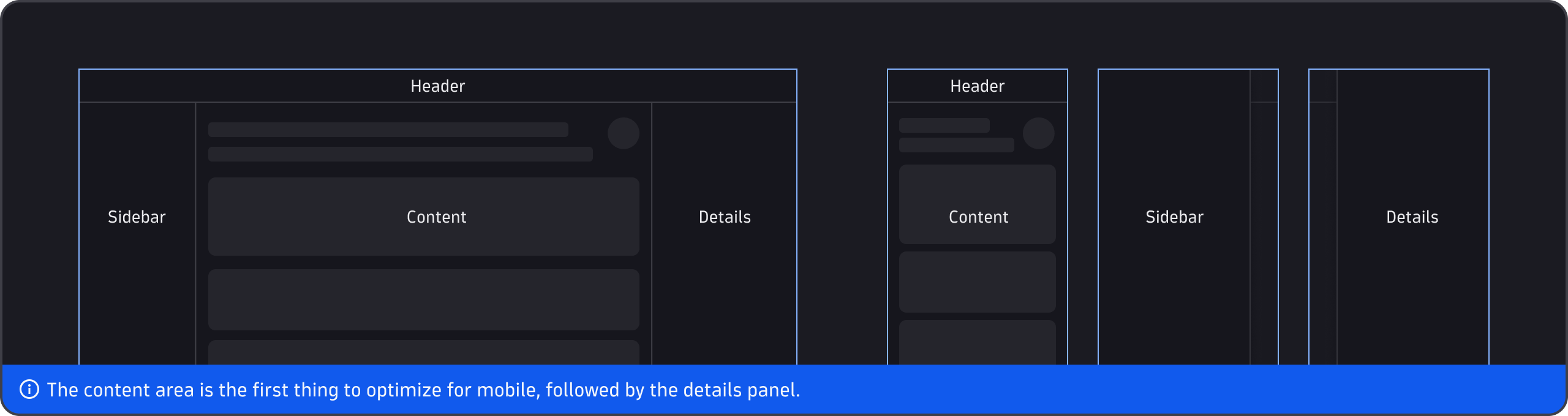
Sidebar and Details
For the Sidebar panel and the Details panel of the PageLayout component, use the defaultWidth prop to set the panel width per breakpoint, rather than leaving it at the component default. Be sure to use the overlay mode for Details on mobile.
| Condition | Recommendation |
|---|---|
| Mobile (≤640px) | defaultWidth: 85%, maxWidth: 85% |
| Tablet (641px–960px) | defaultWidth: 85% (overlay mode; maxWidth left unset) |
See the properties of the PageLayout component documentation for the full list of configuration options, including minWidth, maxWidth, and the breakpoint prop that controls when a panel collapses into a drawer.
Custom grids may contain different numbers of columns depending on the breakpoint. These are our recommendations for wrapping the blocks:
| Condition | Recommendation |
|---|---|
| Mobile (≤640px) | 1–4 columns |
| Tablet (641px–960px) | 1–6 columns |
| Desktop (961px–1920px) | 1–12 columns |
| Widescreen (>1920px) | 1–12 columns |
The wrapping order, alignment, and other grid parameters can be customized using the grid properties.
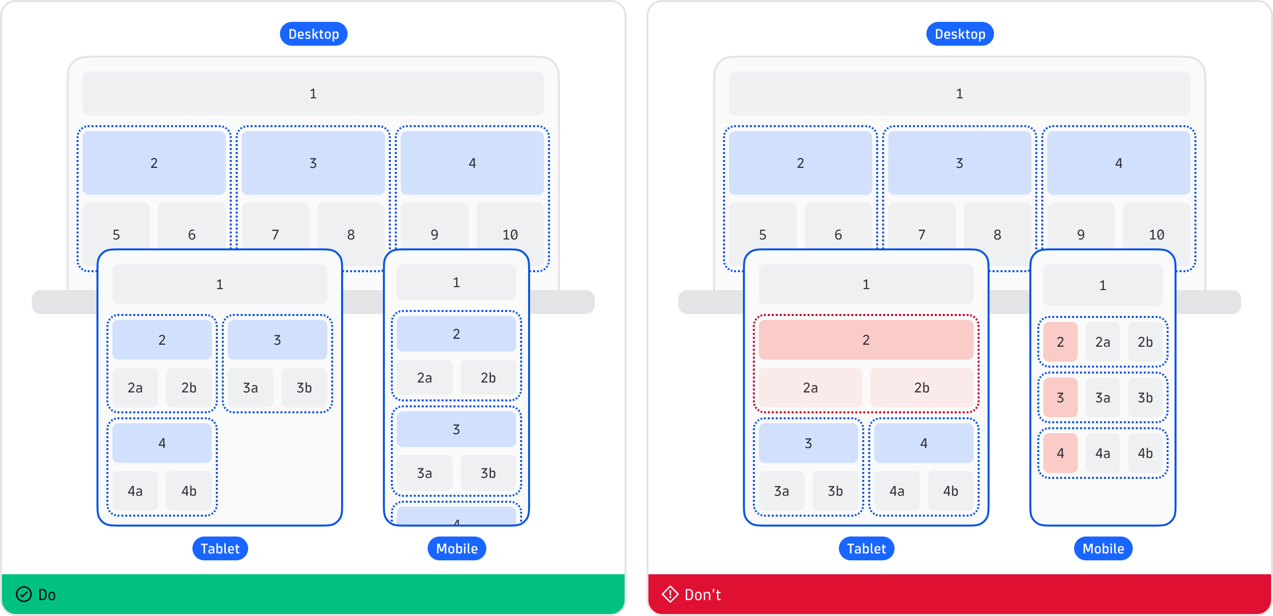
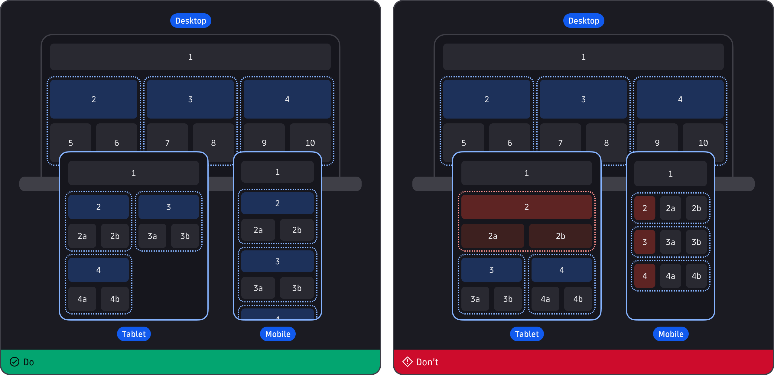
Keep in mind, similar groups should remain proportional, and hierarchy should be preserved at each breakpoint. Don't override the proportions of elements and containers relative to their similar siblings or underlying items.
Tables
| Condition | Recommendation |
|---|---|
| Table needs to render in a narrow or mobile-width container | Use DataTable, not SimpleTable—it lacks the overflow, sizing behavior narrow containers need. |
| Table requires horizontal scroll as a fallback | Acceptable, but may not be clear. |
| Low-priority columns need to be hidden at narrow widths | Combine columnVisibility, onColumnVisibilityChange with useBreakpoint to control visibility per breakpoint—defaultColumnVisibility only seeds the initial state. |
| The visibility-settings modal needs warnings or an error threshold for the number of visible columns | Use maxWarning and maxError on DataTable.VisibilitySettings to configure non-blocking and blocking thresholds. |
Truncation, collapsing, and overflow
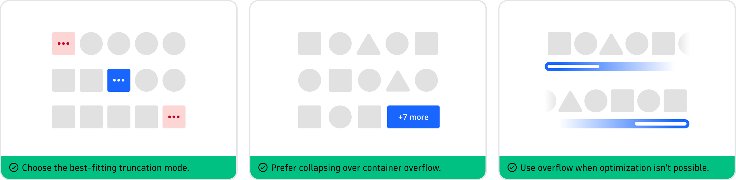
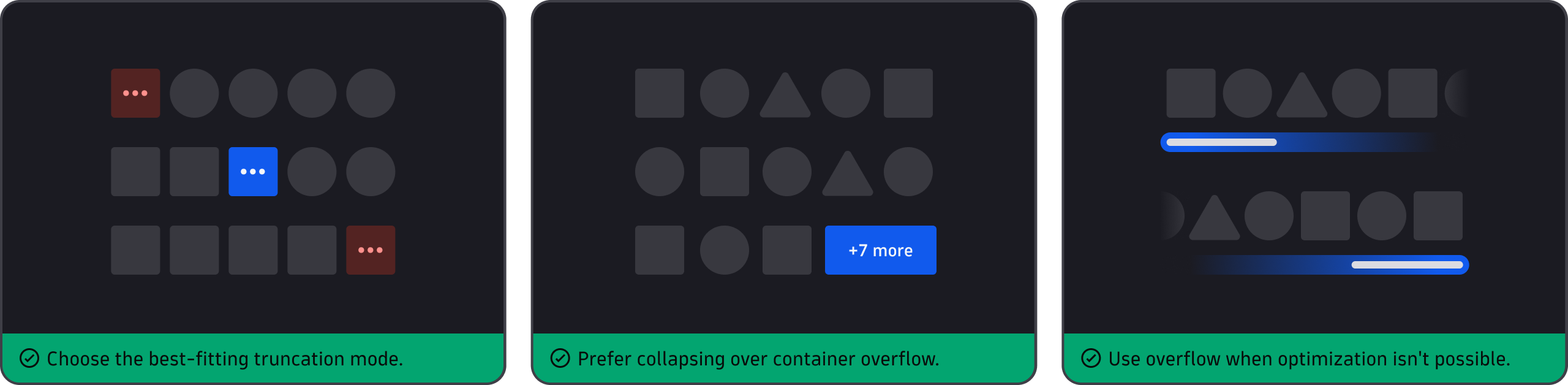
- Never delete—anything hidden by a mobile pattern must be reachable (expandable content, overflow menu, secondary view).
- Prioritize—decide what to collapse first based on importance, not DOM order.
- Rethink hover—don't use hover-only disclosures on mobile. Instead, give important content a tap target.
Inline text elements
The following recommendations apply to labels, metric values, table cell text, inline links, and captions.
Recommendation for truncation: Avoid character-count rules. Instead, use container width with token-based max-width, so truncation is driven by the actual, rendered space.
| Condition | Recommendation |
|---|---|
| Data values (numbers, single-line labels) | Single-line truncation with an ellipsis at the container edge. Full value reachable by tap. |
| Descriptive text, captions | Show up to two lines before truncating. |
Inline block elements
The following recommendations apply to tags, chips, badges, and filter pills.
| Condition | Recommendation |
|---|---|
| Container can grow vertically (for example, a card body, a filter row with its own row height). | Wrap chips to additional lines. |
| Vertical space is fixed (single-row context—table cell, card header, compact list row). | Show what fits and collapse the rest into a "Show N more" ChipGroup. |
| Content is genuinely non-essential (related tags, inactive filters). | Horizontal scroll is acceptable only with a visible edge-fade or scroll cue. |
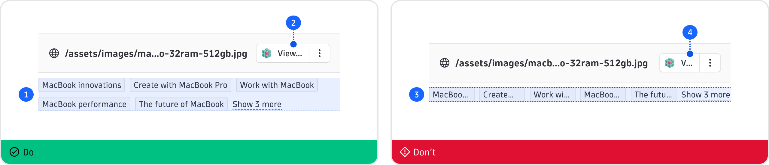
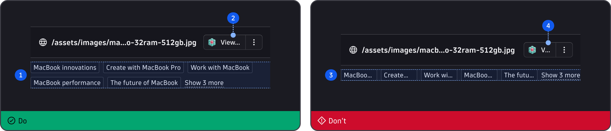
- Wrap, don't cram—use wrapping to keep inline elements readable as the container narrows.
- Set a min-width—give interactive elements a minimum width so labels expose the action.
- Don't stretch to fit—avoid stretching elements that vary in quantity or size, or are mostly text.
- Keep actions visible—don't let truncation obstruct any key actions or labels.
Button lists, groups, and toolbars
If the specific component guidelines don't address your use case, use these tips:
| Condition | Recommendation |
|---|---|
| Full width | No collapsing. Make all buttons visible inline. |
| Narrow (tablet, constrained container) | Secondary and tertiary actions may collapse into an overflow menu; primary action(s) stay visible. |
| Mobile | Truncate buttons, or collapse into an overflow menu if truncation makes the content illegible. |
Card lists
Choose scroll direction based on what the user needs to do with the cards, not on how many cards there are. However, don't mix directions within a page without a clear visual break.
| Condition | Recommendation |
|---|---|
| User needs to compare or scan values across cards (KPI cards, chart cards). | Stack in a single, full-width column. Horizontal scroll works against comparison as some cards are off-screen. |
| Cards are a browsable, homogeneous, non-critical set (related dashboards, recommendations, recently viewed). | Horizontal scroll is acceptable, with a peeking edge and snap-to-card behavior. |
Quick reference
General guidance
- Accessibility—a11y guidance, including the 24x24px minimum touch-target rule and alternative drag-and-drop requirement.
- Breakpoints—token values for recommended breakpoints (640px, 960px, 1920px).
- DataTable—column visibility and pinning, expandable sub-rows, and truncation config (fr-unit sizing, textOverflow, truncateMode, log-content limits).
- Layout—minimum viewport width (320px), centered vs. full-width layout guidance, responsive layout tools (Grid, Flex).
- PageLayout—Sidebar and Details drawer collapse behavior and per-panel breakpoints.
- useBreakpoint hook—media-query hook for reading breakpoint state in custom components.
Specific guidance
- App structure patterns—sidebar, main, detail view functions.
- AppHeader—collapses nav items into a menu under space constraints.
- ChipGroup—use
maxVisibleChipsto limit the collapsed set and addChipGroup.Controlto provide the "Show more" interaction. - FilterBar—optional filters to pin and unpin into an "Add filter" overflow dropdown.
- Guided interaction—expandable text pattern—"never hide critical info," Show more, Show less copy convention.
- Page (deprecated)—same concept as PageLayout, older API; superseded by PageLayout.
- TextEllipsis—truncation modes (start, middle, end); its tooltip-on-overflow pattern relies on hover, which doesn't work on touch.