Functional icons
Functional icons visually highlight key functionalities. Used well, they can reduce clutter and help users easily understand the interface and their options.
Functional icons attract users' attention and emphasize important elements or actions in your interface. Compare these examples:
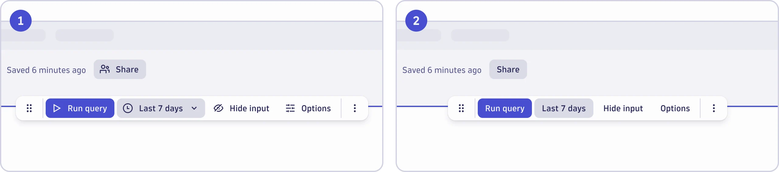
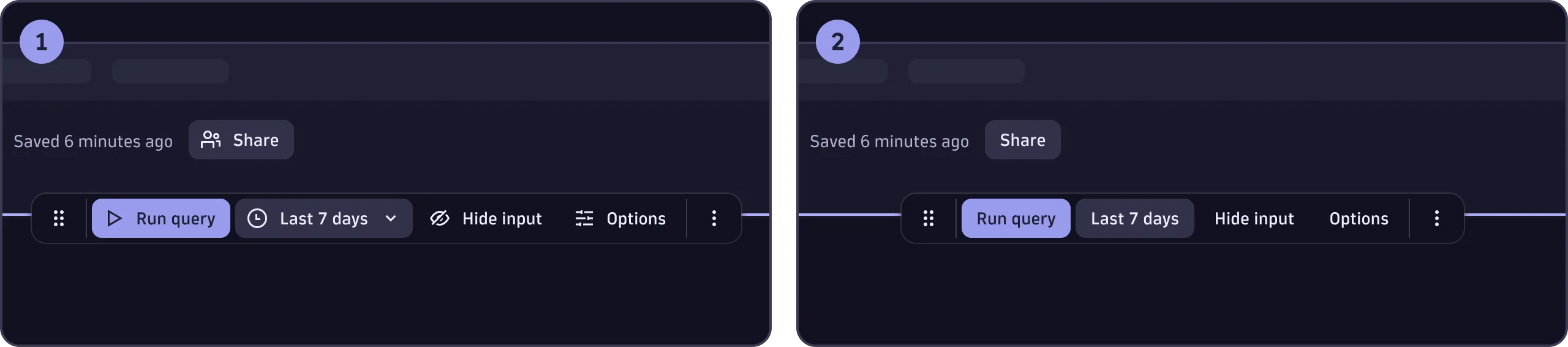
- Interface with icons
- Interface without icons
Use functional icons to enhance usability, not for decoration. Think carefully about where to add icons and pay attention to their semantic meanings. The following guidance will help you use icons effectively.
Semantic meaning
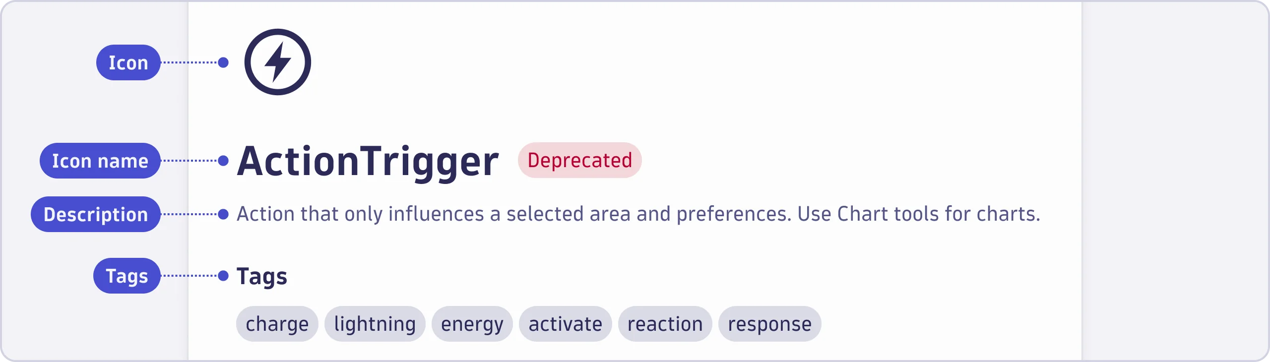
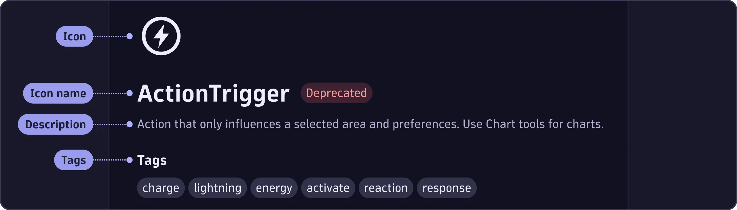
Before you use an icon, make sure its semantic meaning fits your use case: select the icon in the Functional icons library to read the icon description and tags.
Never use the same icon for unrelated purposes, as that would dilute its meaning and confuse users.
Labels
Labels provide additional context and meaning to icons. If there's space, use a label.
Avoid using tooltips as substitutes for labels. This is particularly true for icons that aren't universally known, or which represent complex actions or abstract concepts.
Always use vertical- and center-alignment when placing an icon next to a label.
There are a few exceptions where an icon can be used without a label:
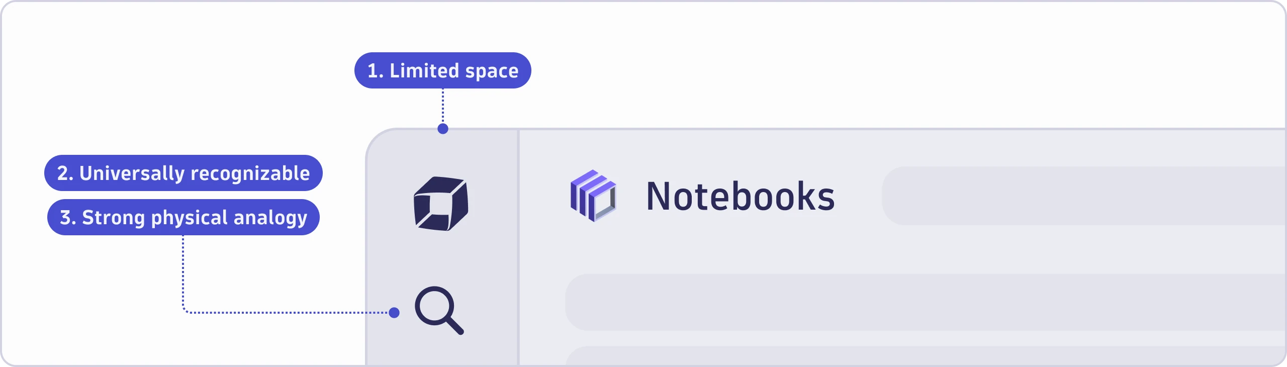
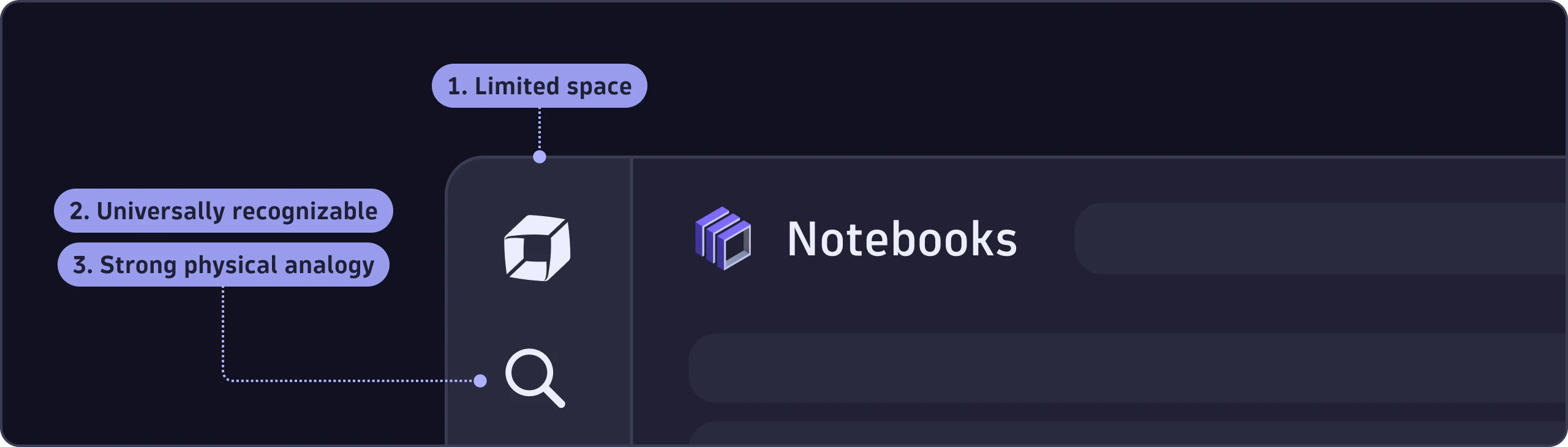
- If space is extremely limited (too small for text alone).
- If the icons are universally known. Example: a magnifying glass for search.
- If the icons look like what they represent. Example: a red rectangle to set a background as red.
| Universally-known icons | Semi-universally-known icons | Not universally-known icons |
|---|---|---|
  |   |   |
Icons without labels must have a proper aria-label so the meaning is
accessible to people using screen readers.
Position
Prefix slot
Place the icon in front of the label (prefix slot) if it represents and clarifies the label itself.


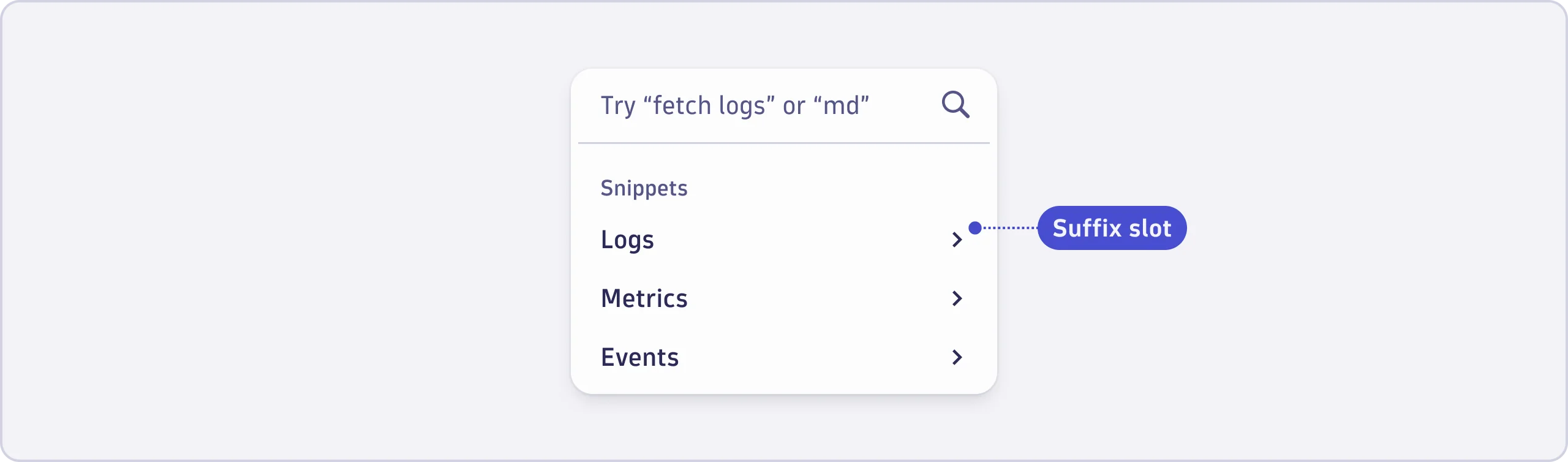
Suffix slot
Place the icon after the label (suffix slot) if it indicates additional functionality or extra information beyond the label.

Outlined or filled
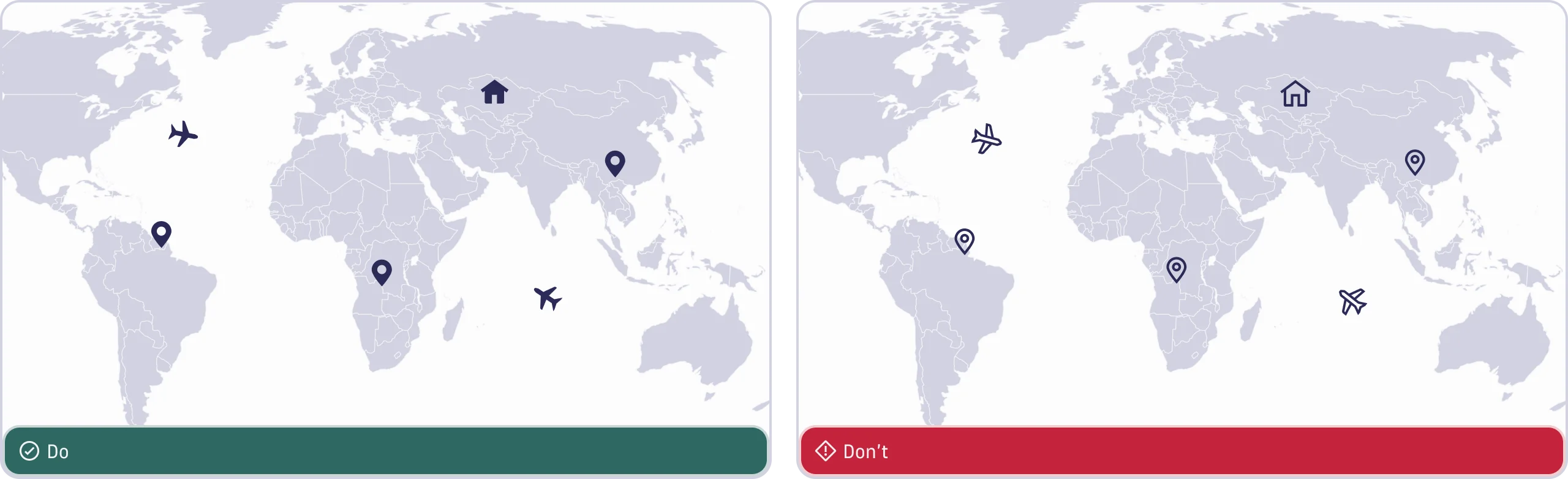
Functional icons come in outlined and filled versions. Each version serves a different purpose.
Outlined icons have a light, clean style that works well in dense UIs with plain backgrounds. Use the outlined icon style for basic interface elements, such as buttons, navigation, and toolbars.
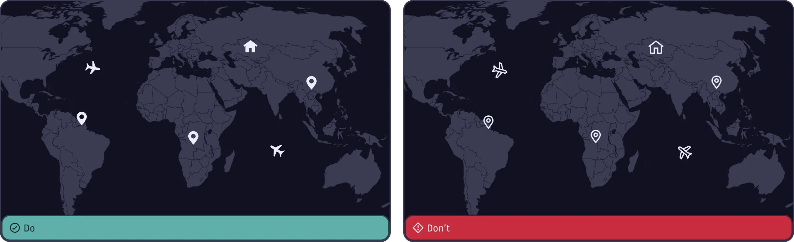
Filled icons are designed specifically for use on geospatial maps. They have a bold, solid appearance that ensures visibility against complex map backgrounds.
The outlined and filled versions of certain icons, such as the Favorite icon, can also be used to represent states.
Size
The icons come in three predefined sizes which are set using the size prop:
- Default (20px) - Pairs best with
Typography.Text.Basetokens. This is the size to use in most cases. - Small (16px) - Pairs best with
Typography.Text.Smalltokens. Use this size when space is limited. - Large (32px) - Use sparingly for thumbnails, headers, or other prominent placements.
Use the predefined sizes to maintain consistency. If your use case absolutely
requires a different size, you can pass a custom pixel value to the size prop.
App icons as functional icon
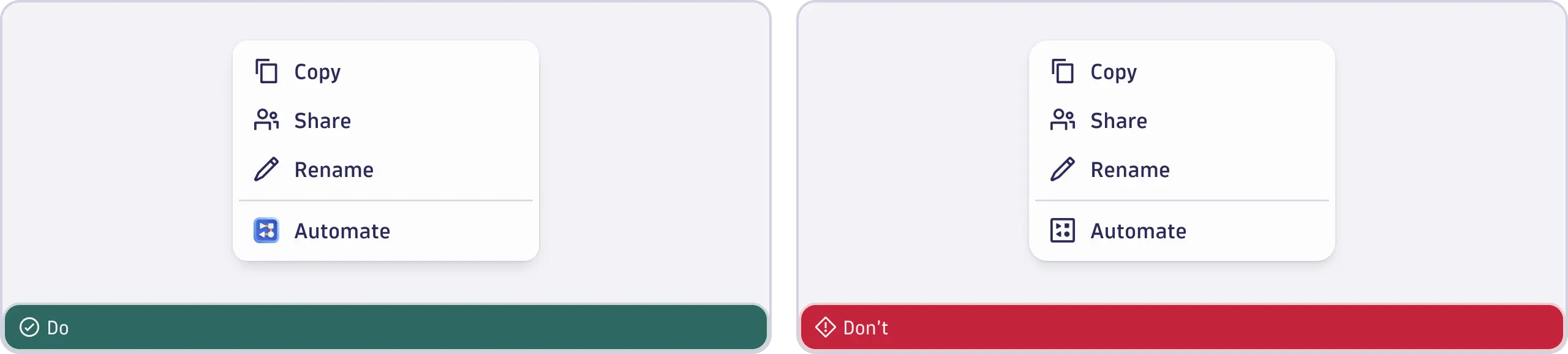
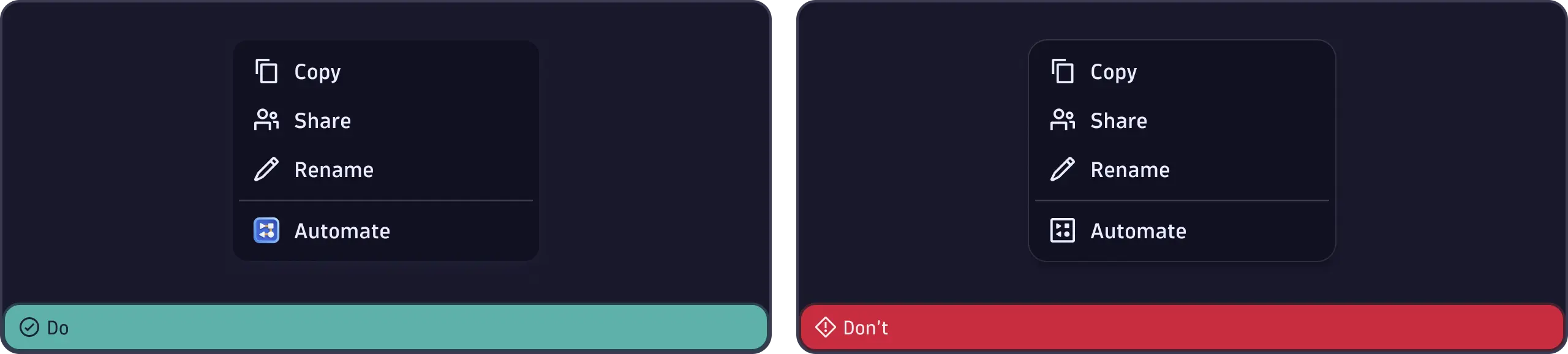
To reference a specific app, use its full-color app icon.
Special use cases
| Icon | Usage |
|---|---|
  | Outlined icons: Use this default style everywhere in the interface except the geospatial map. |
  | Filled icons: Use on the geospatial map or to indicate a selected state, as with the Favorite icon. |
  | Subscripted icons: Use on the geospatial map to point to a specific place. Icon starts at the bottom of the grid. |
  | Arrows: Use to link to other pages within the product or to show direction or trends. |
  | Chevrons: Use to indicate expandable and collapsable components in a list or dropdown, option to navigate to the next or previous step, view overflow items, or expand a tree. |
  | Options: Use for configurations that only influence a selected area and preferences. |
  | Settings: Use for platform-wide configurations, for example, to change defaults. |
  | External link: Use for external links, which open apps or pages outside of the Dynatrace product. |
  | Link: Use for links. |
  | Share: Use to share with other people or apps, or to see more share options. |
  | Group: Use to share with a group of people. |
Accessibility
Be sure to give users enough informaton about the context and functionality. This is especially true for icons without labels.
Set an aria-label for every icon that doesn't have a label and ensure that
aria-hidden is set to false.
If the icon shouldn't be part of the accessibility tree, use
aria-hidden="true".