Forms and validation
- Reference
- 5-min read
Use forms and form elements to get input from users or let them configure options. For component-specific guidance, open the Usage tab in the documentation for the individual component.
Anatomy of a form element


- Label
- Placeholder
- Hint
Labels


Labels help users understand the purpose of the form. Labels are required unless the purpose of the form is obvious from the context. Labels should always be short and descriptive. Eliminate unnecessary articles (a, an, the) and obvious or redundant words, and never add a period.
Placeholders


Placeholders show users which input is expected. In addition, they increase the contrast and visibility of unfilled form fields. Our form field components come with default placeholders that work in most situations, but they can also be customized when necessary. Be aware that placeholders disappear as soon as users start typing in the field. Always use hints for information users need to complete the task.
Hints


Use hints to provide in-context guidance that helps users fill a form element correctly. Contrary to placeholders, hints are always visible, even after the user starts typing in the field. Therefore, hints should be used for information users need to complete the task — for example, special characters required for a password. Keep hints short and to the point.
Required form elements


If a value is required in a particular form field, add an asterisk at the end of the label.
Building a form
Forms group multiple, related form elements together. The following guidelines ensure that users can rely on a consistent experience across multiple pages or apps when filling out forms.
Spacing
Spacing communicates the relationship and hierarchy between individual form elements. Use the following guideline to ensure sufficient spacing between form elements:

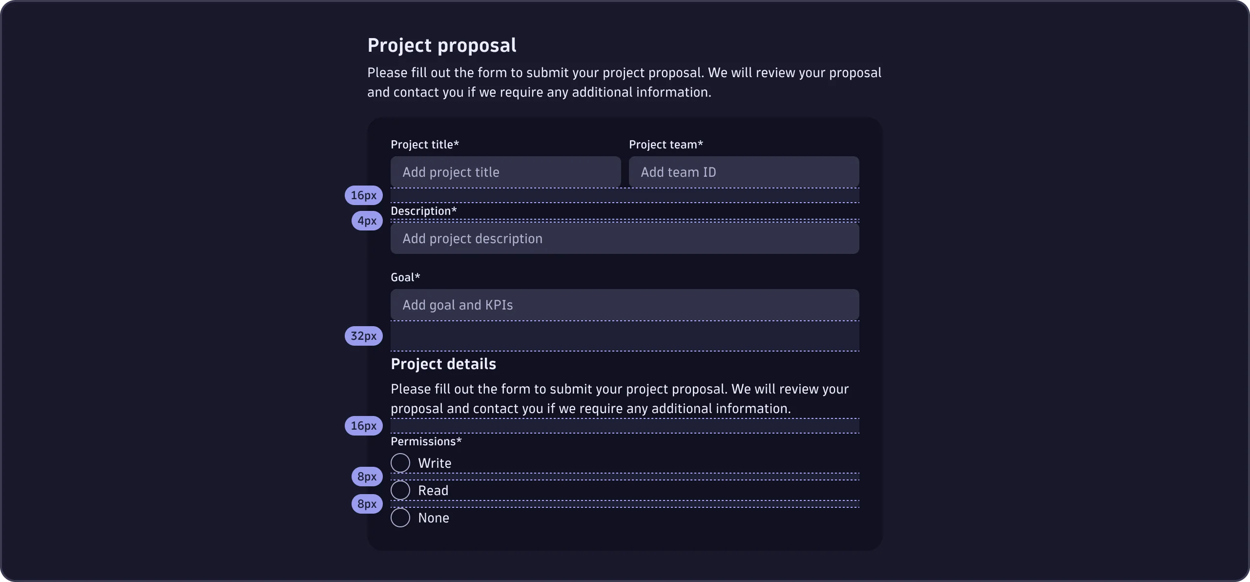
- Vertical spacing between groups of form elements is 32px.
- Vertical spacing between form elements is 16px.
- Vertical spacing between checkboxes and radios is 8px.
- Vertical spacing between labels and form elements is 4px.
The maximum recommended width for single-column forms is 480px. Always use our spacing tokens.
Columns
Single-column layouts are best for forms. Each form element gets its own row. Avoid multi-column layouts in forms, as they interrupt the vertical momentum of moving down the form.


If you must use a multi-column layout in a form, follow our spacing guidelines to ensure sufficient spacing between columns of form elements:
- Horizontal spacing between form elements is 8px. Always use the spacing token.
Sizing form elements
The width of form elements should always reflect the expected length of the input. To ensure visual clarity in a single-column layout, or if the expected input is unknown, form elements may also fill the width of their parent.
Buttons in forms
Use buttons in forms to let users submit or discard a form, or move forward in a multi-step form process.


Alignment
Buttons in our forms are left-aligned by default. You may right-align buttons in forms if they're:
- Part of a wizard or multi-step form.
- Inside a modal or overlay.
Spacing


Vertical spacing between form elements and buttons is 32px. Always use the spacing token.
Emphasis
Use an accent emphasis button for the main action. For any other action, use minimal emphasis buttons. See Button for information about the different emphasis variants.
The order of the buttons depends on their alignment:
- If the buttons are left-aligned, the main action is placed first.
- If the buttons are right-aligned, the main action is placed last.
Validation and errors
Sometimes users make mistakes when filling out forms. Always validate input and explain errors to help users quickly and efficiently correct mistakes.
Showing errors in form elements
Provide a clear, concise error message that explains why validation failed.


In forms, errors caused by validation need to be resolved before users can successfully submit the form and continue. Clear, understandable error messages are crucial for user experience and successful form completion.
Types of validation
As a rule, validate groups of form elements on submission. This way, users can fill out forms without interruption and focus on providing the required information. In certain scenarios, however, it may make sense to validate individual form elements as the user's input changes and provide immediate feedback.
Immediate
Immediate form validation should only happen when users finish providing input, and focus leaves the entire form element.
The only exception is if the input of a form element is already in an invalid state, and giving users feedback while they're typing will help them resolve the issue.
For overlay-based components such as Select, SegmentSelector, or TimeframeSelector, show validation errors when the overlay closes rather than when the outer component loses focus. Because the overlay is the primary interaction surface, its closing is the natural signal that the user has finished their input.
On submit
We recommend validating the user's input client-side. However, if the data is validated server-side and the response takes time, disable the form's elements and put the submit button into a loading state to prevent multiple submissions while users wait for a response.
The first invalid form element should be focused and scrolled into the viewport if a form validation fails. Otherwise, in long forms, users might not notice an error. After users have submitted a form and its validation fails the first time, be sure to provide immediate validation for form elements.
Never block users from submitting a form by disabling the submit button. Sometimes, users unknowingly leave out information for one or more required form elements. A disabled submit button with no clear cause, makes for a frustrating experience. Instead, let users submit the form, then show that input is incomplete or incorrect.