Design a UI for workflow actions
Workflow actions should follow the same base structure to ensure a consistent user experience across the Dynatrace platform ecosystem. A few guidelines and components can give a familiar structure and, ultimately, make your Workflow actions experience more enjoyable and easier to comprehend.
At a glance
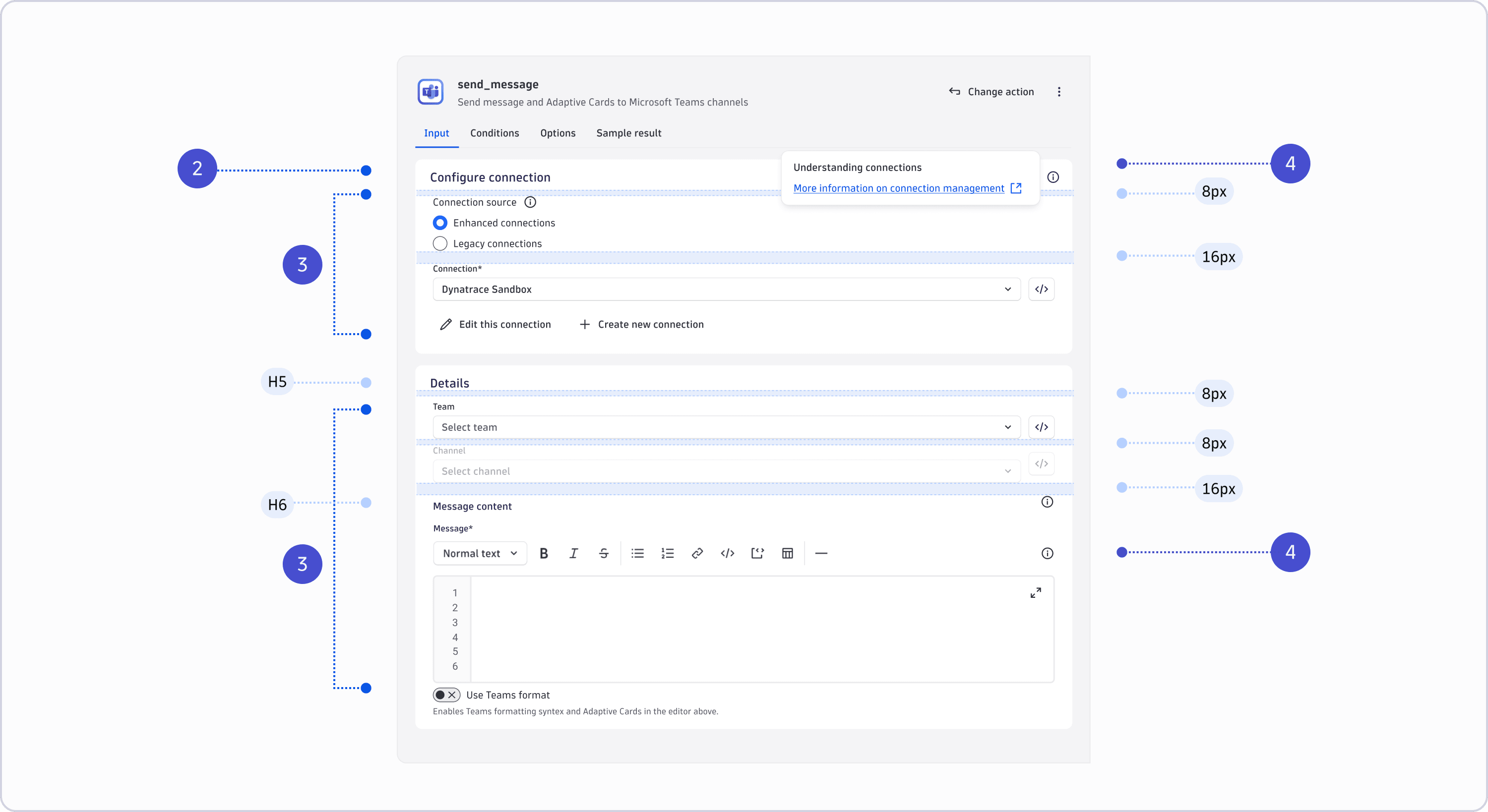
1. Always use automation action components
Workflow task input configuration provides dynamic values from expressions, not only static values. To support this use case, use specialized UI components—automation action components—instead of generic Strato form components. These components support expression autocomplete, chip highlighting, and preview values alongside static values. For example, use AutomationSelect instead of a standard select or radio buttons.
2. Put Connection pickers on top (if you need one)
If your action connects to a third-party system, place the AutomationConnectionPicker at the top of the form—before any other fields. Skip it for actions that only interact with the Dynatrace platform. If you use the connection to power lookups in other fields (for example, fetching a list of tables), those lookups must degrade gracefully. A connection might be selected dynamically by expression at runtime, or the third-party system might be unavailable, so your UI must not rely on a valid connection to provide values or perform validation. Catch errors silently and show a hint such as "Can't retrieve list of tables currently" rather than displaying a form error; never block the user from editing the field manually.
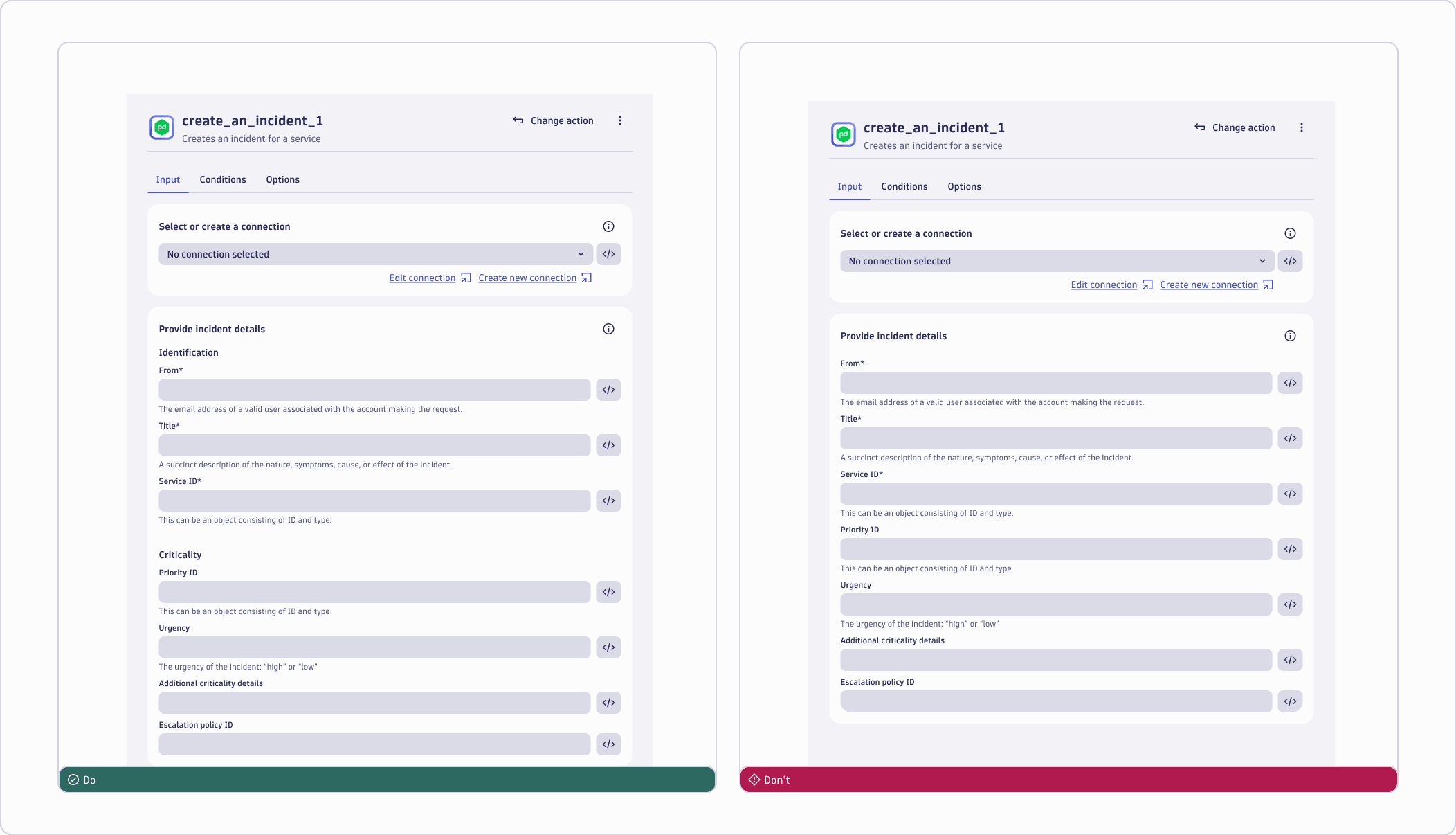
3. Use groups to organize your form fields
Group related fields under a named heading — never leave them scattered across an undivided form. Each group can have an optional description for general context; if guidance applies to one specific field, put it in that field's hint instead. For longer actions, use multiple independent groups for separate concerns, and add subgroups when fields within a group share a sub-context for a better structured visual representation.
4. Use a common location for linking to doc
Place a help icon in the top-right corner of each group — this is where users look for documentation links across all actions. It opens an overlay menu with links to the relevant docs users need to complete their task. Don't use a regular tooltip for this — tooltips disappear, and documentation links are task-critical.
About workflow tasks
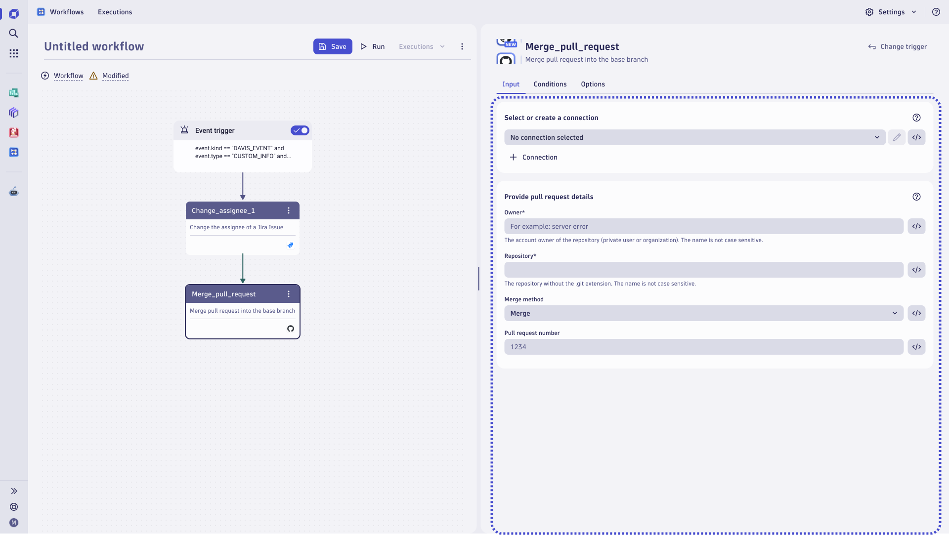
Below, you can see an overview of the Workflows app. It displays the workflow action in the right-side panel, which we call the detail view. This guide will help you design the detail view. Placing an action in a workflow adds a task comprising the selected action and its values.
Detail view building blocks
A workflow task consists of the following building blocks:
- Workflow task header
- Workflow action widget
Workflow task header
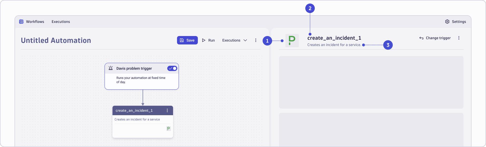
The workflow task header is provided by the Workflows app and is automatically populated when a user selects your action. As an action developer, you define the following in the app config:
-
App icon: Displayed next to the task title which is compiled based on the action name as defined at the app level. You can find more information about third-party icons in our documentation App Icons.
-
Task name: Pre-populates the task name when the action is selected based on
nameof your action. It sets the user's initial expectation of what the task does. -
Task description: Pre-populates the task description when your action is selected based on
descriptionof your action. Keep it short and specific.
Workflow action widget
-
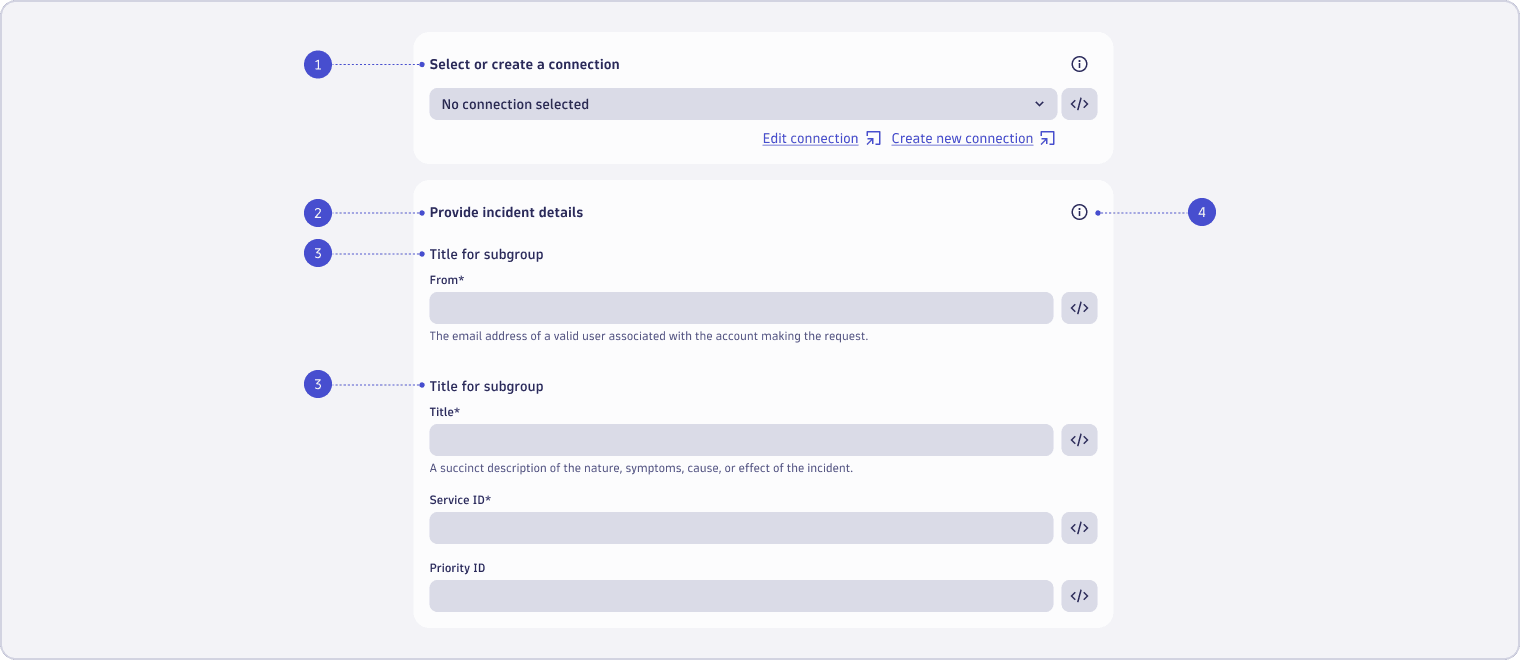
Connection: Use the AutomationConnectionPicker component. The link to “Create new connection” opens a modal for this Connector. Use the format “Select or create a connection” as the title for this section. Because of this title, the select field doesn't need its own label.
-
Task inputs: This section contains a structured block of form fields that users need to complete for this action. Use the format “Provide [content of this action] details” as the title for this section. The title should clearly refer to the goal of the action to add value for the user. For example: "Provide message details," "Provide incident details."
-
Subgroups of task inputs: A title that separates form fields into groups of content. One action can have several groups. Read more about grouping content here.
-
Help: a help icon button that holds contextual information, such as links to documentation. Read more about providing contextual help here.
Use automation action components
Automation action components provide Workflows-specific functionality compared to the standard Strato form field components. Automation action components offer autocompletion, chips, an expression editor, and an expression preview, which are essential to users defining dynamic task inputs using expressions.
AutomationConnectionPicker
Whenever your users need to set up a third-party connection before using a Workflow action, use the AutomationConnectionPicker. This component handles the user flow of the provided actions for editing and creating a connection out-of-the-box. To understand the user journey and see where the buttons and links provided by this component will lead, refer to the visualization below for the flow. Note that you can't configure this flow yourself:
Placement: Always place the AutomationConnectionPicker at the top of the form — before any other fields. If your action only interacts with the Dynatrace platform, skip it entirely.
Resilience: If you use the connection to power lookups in other fields (for example, fetching a list of tables from the target system), those lookups must degrade gracefully. A connection might be selected dynamically by expression at runtime, or the third-party system might be temporarily unavailable. Your UI must never rely on a valid connection to provide values or perform validation — catch errors silently and show a hint such as "Can't retrieve list of tables currently" instead of a form error. The user must always be able to edit the field manually.
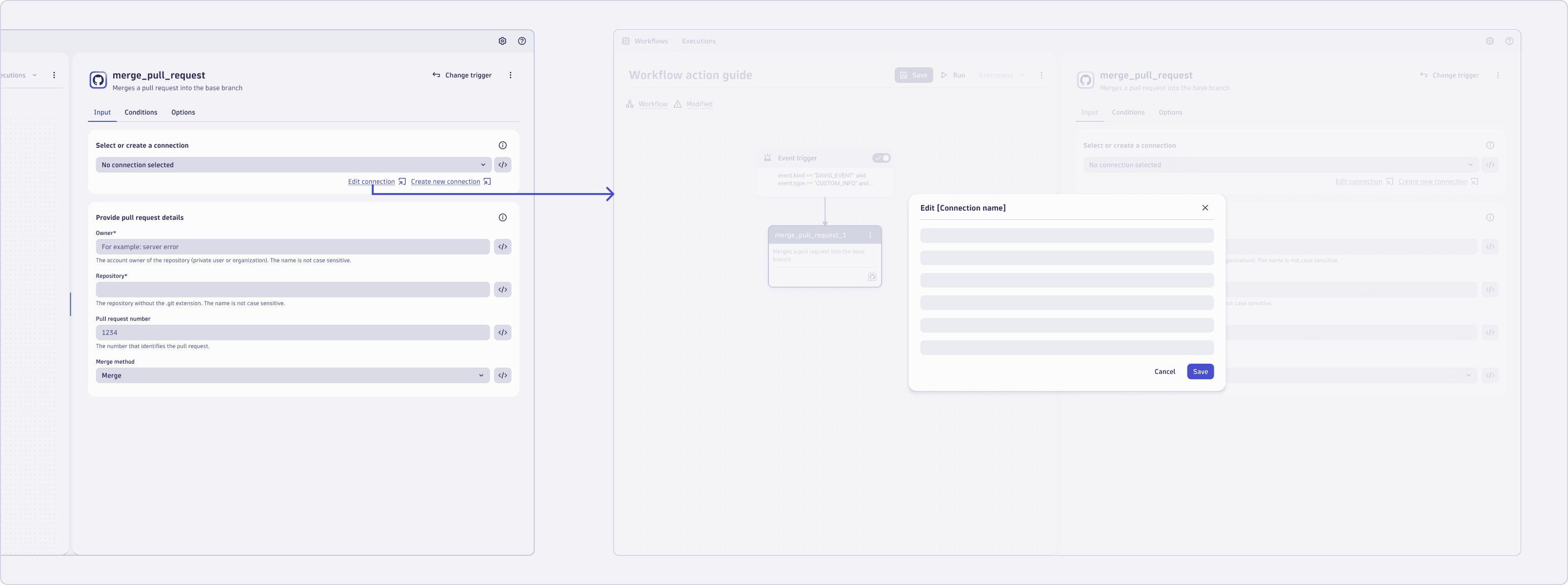
Edit a selected connection
When the user selects "Edit connection”, a modal intent with the connection details pops up. With the right permissions, the user can edit the connection.
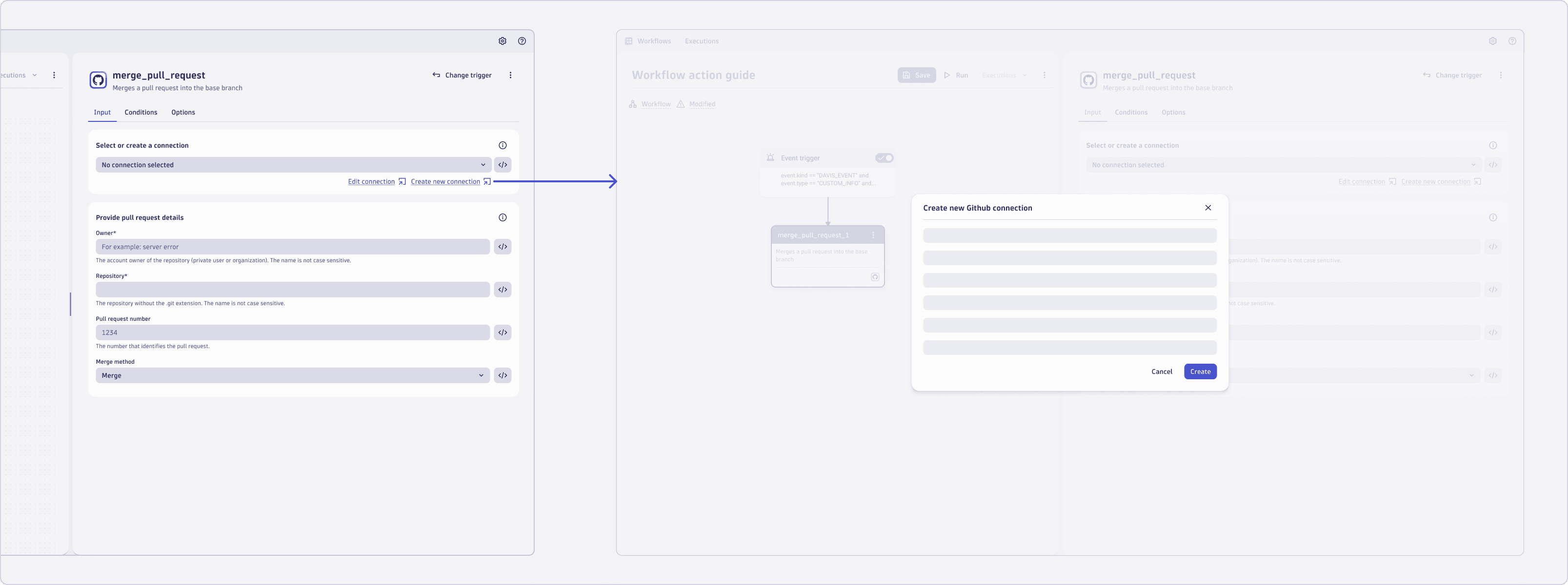
Create a new connection
When the user selects "Create new connection," a modal intent for adding a new connection for this third-party integration pops up. With the right permissions, the user can create the new connection.
AutomationTextInput
If your users need to fill in a single line string or expression, use the AutomationTextInput component.
AutomationNumberInput
If your users need to fill in a single line number or expression, use the AutomationNumberInput component.
AutomationSelect (= drop-down select)
The Workflow Engine provides the AutomationSelect component that combines extra functionality within a drop-down select component. Use this component if:
-
You have a list to choose from.
-
Your users can enter an expression instead of selecting from a list of items.
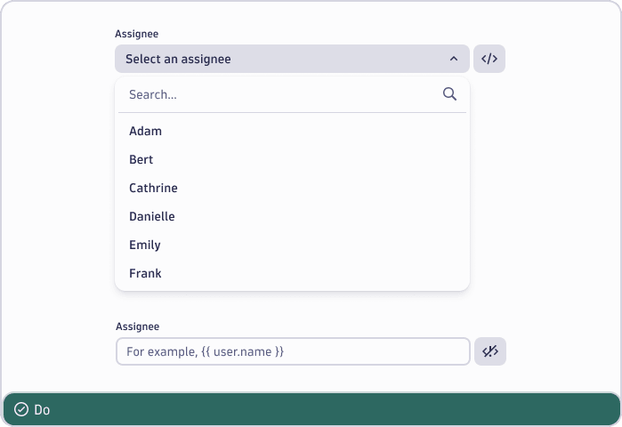
You need to use AutomationSelect when creating automation widgets because of its specific characteristics for writing expressions. Even if radio buttons are the correct control, you shouldn't use them because they don't allow the user to provide an expression to dynamically define the value.
AutomationCodeEditor
If you expect your input to be an expression longer than one line, use the AutomationCodeEditor. It has autocompletion, which allows users to enter code faster. If the expected input is only text rather than code, use the Strato TextInput or TextArea instead.
Structure and layout
When creating workflow actions, simplicity is key. By doing so, you ensure that users can efficiently complete their tasks without unnecessary complexity. Here are some guidelines to achieve this:
-
User-Centric approach: Deliberately think about the information users need to accomplish their goals. What data or context is essential for them? Prioritize clarity and relevance.
-
Contextual information: Provide relevant information at the right moment. Consider integrating contextual help and information.
-
Avoid clutter: Be mindful of the user interface (UI) and the available space. Information overload can confuse users and hinder their progress. Present details succinctly, focusing on what truly matters.
-
No feature overload: An action widget is mostly a basic form. It may add supportive functionality to pick values, but only as optional support for the user, never as a strict validation mechanism. Instead, think about proper user feedback in the log of the action when it runs.
Group form fields
As shown in the overview, workflow actions should follow the laid-out structure. To reduce cognitive load for users, try to combine related information into smaller groups.
You can do this by thinking about which information relates to another. If form fields are related, they should be grouped. It's about creating meaningful, visually distinct content units that make sense in the context of the larger whole.
Each group can have an optional description for general context. If guidance applies to a specific field rather than the whole group, put it in that field's hint instead. For longer actions, use multiple independent groups for separate concerns, and add subgroups when fields within a group share a sub-context.
Anatomy of each group
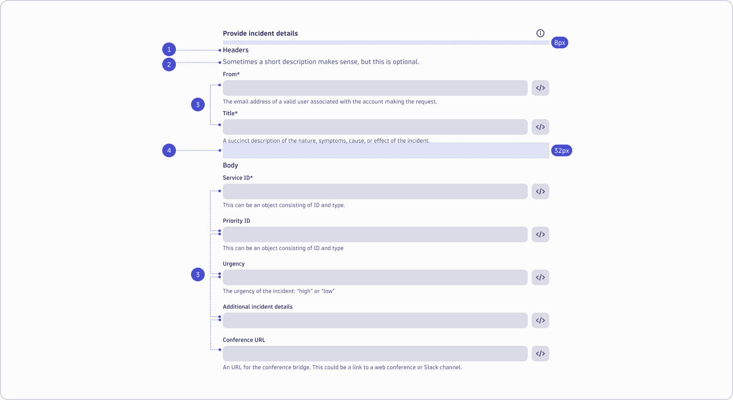
You can structure your Workflow action by using the following building blocks.
-
Heading: Give the group a meaningful title, to make the user understand what input is expected. This could also mimic the structure of an external documentation.
-
Description (optional): It's not always needed to give additional instructions, but if there is general information that users need to finish the task (goal), add it here. Make sure to provide it in clear, concise, and short sentences. If information is needed only for specific fields, provide a hint below the respective field instead.
-
Form fields: The input fields that users need to fill in. Try to follow the naming of the system you integrate with as much as possible, so that it's easy to find documentation and determine what the input is for.
-
Whitespace: We use the appropriate spacing between form groups, to visually separate them. You can find more details on form field spacing in our UI design documentation.
Common location for linking to documentation
We recommend offering information and help where needed to ensure our users can quickly finish their tasks or goals. However, don't go overboard with information and add everything a user could potentially need. This would clutter the UI and add cognitive load for the user.
Depending on your content type, there are many ways to assist users in filling out our forms. To get you started, have a look at the component list below, which describes when and how to use them.
| What | Where it should be | Example | Links to Strato documentation |
|---|---|---|---|
| A link to internal and external documentation | Overlay menu triggered by Help button | 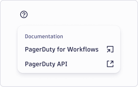 | |
| A term that describes the input you expect from users | Label |  | Labels in forms and validation |
| An example that shows how an input could look like | Placeholder | Note that a content review is pending for the placeholder. For now, depending on the available space, you can either use "For example," or "E.g.," | Placeholders in forms and validation |
| A default value that's true for most cases | Default value |  | Forms and validation |
| Helpful information about what type of input to expect or in which format | Hint |  | Hints in forms and validation |
| An explanation of using a specific term that is used | Information overlay that's triggered by an info icon next to the term (on select, not on hover) | 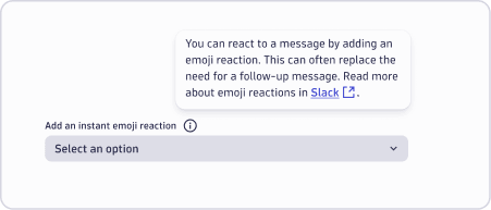 Note this is currently not supported in our Strato components but will be available soon. Note this is currently not supported in our Strato components but will be available soon. | |
| Additional information, explanations, or context about a particular element or feature | Tooltip |  | Tooltips in guided interaction |
Help button with links
Use help buttons to guide users to related information that is relevant to completing their task. These buttons are always placed in the top right corner of each content block and open a menu that includes links to further documentation.
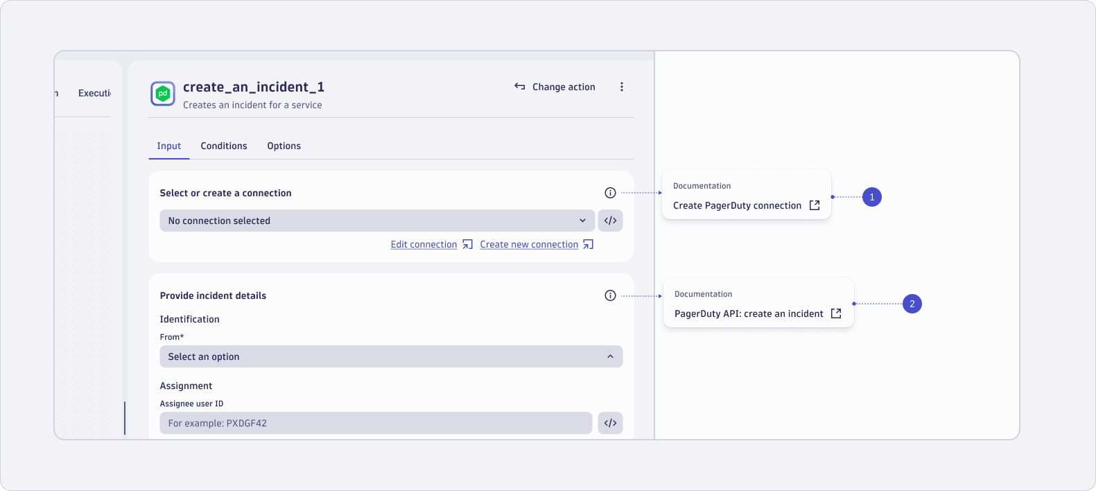
In this example, we give internal and external links to the documentation. Depending on the type of link, we use the respective icon as a suffix to the link.
-
Connection help button: We provide a link to our respective documentation. See: Solutions > Automations > Workflows > Connectors > [Connector name].
-
Third-party help button: Provide links to (integration) documentation that users need to finish their tasks.
Deprecation of workflow actions
If a workflow action becomes deprecated, you will need to communicate this information to your users.
- Prefix: Add “(Deprecated)” as a prefix to the actions title
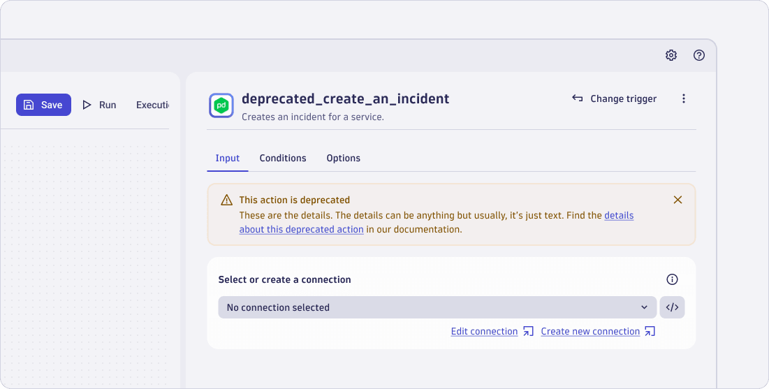
- Warning message: Add a warning message inside the action that's deprecated
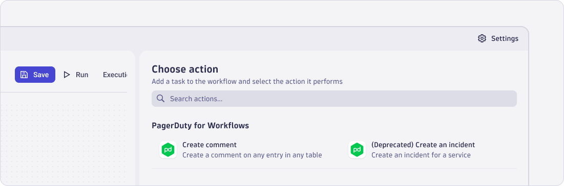
In the list of actions, the "Create an incident" action is labeled as "(Deprecated)" to avoid the usage of this action within new Workflows.
Add a warning message inside an action that's deprecated, as shown in the example below. Make sure to link to further documentation so that the user can find more information about handling deprecation. If there's a new recommended action to be used instead of the deprecated one, tell the user in the message.