Layout
- Reference
- 11 minutes
Apps on the Dynatrace platform are based on fundamental layout patterns to support a consistent user experience. Use the following layout tools and standards to structure your app and ensure an accessible, responsive, and familiar user experience.
Responsive layouts


A responsive layout ensures that your app's content adjusts to fit different screens. This is especially important given the wide range of devices used to access the platform, including mobile phones, tablets, and desktops.
Our grid and flex components will help you establish a responsive layout that adapts to the user's screen size.
Grid


The grid component divides your content into rows and columns, creating a grid-like structure without visual styling. Use the grid component to create a basic layout and apply your visual styling to achieve the desired look and feel.
Flex


Use the flex component to lay out content vertically or horizontally and create flexible layouts that adjust to the available space. It comes without visual styling. Use the flex component to create a basic layout and apply your visual styling to achieve the desired look and feel.
Breakpoints
Our breakpoint tokens for mobile, tablet, desktop, and widescreen displays allow you to create layouts tailored to the specific needs and unique characteristics of each type of device:
- Mobile: 0 - 640px
- Tablet: 641px - 960px
- Desktop: 961px - 1920px
- Widescreen: 1921px - ∞
Minimum width
While Dynatrace is mainly used on desktop screens, your app also has to work on smaller screens, offering the same features and functionalities. The minimum viewport width we target is 320px, which complies with WCAG 2.1 requirements. Depending on your app's complexity and target audience, consider optimizing it for tablet and mobile users.
Centered versus full-width layouts
Both centered and full-width layouts are effective in different situations. The right choice will depend on the specific needs of your app.
Centered layouts


Centered layouts restrict the width of the main content and center it on the page. Use the centered layout if your app has lots of reading content, such as text-heavy articles or documentation.
When using the centered layout, restrict the main content to 960px, which corresponds with our breakpoint token for the maximum width of tablet screens.
Full-width layouts


Full-width layouts don't restrict the width of the main content. Use the full-width layout for data-heavy apps where the primary focus is displaying large amounts of data.
Visual hierarchy
A clear visual hierarchy helps users understand the relationships between user interface elements and how content is logically structured. Additionally, it helps users scan information and focus on what's essential.
Base
All content is placed on your app's background, the base.


Surfaces
Surfaces are the primary means for structuring your content. To learn more, visit surface component documentation.


Visual characteristics
- Surfaces have rounded corners.
- Surfaces have a background color.
The design tokens provide dedicated surface background colors and border radii.
Elevation
Surfaces are the only elements that can have an elevation level and thus overlay other content.


Each elevation level serves a different purpose:
- Flat: By default, surfaces are flat and have no shadow.
- Raised: Raised surfaces draw more attention and should only be used sparingly.
- Floating: Floating surfaces overlap other content.
All elevation levels are visualized with box shadows, which are dedicated design tokens.
Composition
Surfaces have an inset spacing of 24px (or 16px for dense layouts). Where space is limited, such as menus and overlays, you can apply a minimum inset of 4px. Content within surfaces must not fill the entire width. Ensure a minimum of 4px inset spacing. Spacing tokens must be used when applying inset spacing.


Interactivity
Surfaces can be interactive, clickable elements, which means the whole surface can trigger an action. Surfaces communicate changes to their interaction states (rest, hover, active, and drag) through elevation level changes.


There are dedicated box shadow design tokens for the rest, hover, active, and drag states of surfaces.
Containers
Containers highlight essential information that should stand out from surrounding content and, if needed, convey a semantic meaning. To learn more, visit container component documentation.


Visual characteristics
- Containers have rounded corners.
- Containers have a background color.
- Containers have a surrounding border.
The design tokens provide dedicated container background colors and border radii.
Semantics
You can style containers in five different colors. Each color variant communicates a different level of importance.


- Neutral: The default container color is neutral. It may appear multiple times on a page.
- Primary: The primary color communicates important messages to the user. It should be used sparingly. It can only appear once per page.
- Success: The success color communicates that an action or operation was successful.
- Warning: The warning color indicates that something is about to go wrong. The user's attention is required.
- Critical: The critical color indicates that something went wrong. The user's immediate attention is required.
There are dedicated design tokens for all the container color variants.
Emphasis
Each container color variant comes in three different levels of emphasis:


- Default: The default emphasis level.
- Emphasized: The emphasized level provides more contrast to the background and, thus, draws attention to an element.
- Accent: The accent level provides the highest contrast to the background to draw the most attention. Use it sparingly.
There are dedicated design tokens for all background colors and emphasis levels.
Composition
Containers have an inset spacing of 16px. You must use our spacing tokens when applying inset spacing.


You can split containers into different sections to create more complex layouts. To establish sections, use a divider that spans the full width of the parent container. Additionally, you may use a different emphasis level to create a strong visual separation.
Fields
Fields are the smallest parts of a user interface and enable you to highlight or group content visually. If needed, they can convey a semantic meaning.


Visual characteristics
- Fields have rounded corners.
- Fields have a background color.
The design tokens provide dedicated field background colors and border radii.
Semantics
You can style fields in five different colors; each color variant communicates a different level of importance.


- Neutral: The default field color is neutral. It may appear multiple times on a page.
- Primary: The primary color communicates important messages. It should be used sparingly and only appear once per page at most.
- Success: The success color indicates that an action or operation was successful.
- Warning: The warning color warns that something is about to go wrong and the user's attention is required.
- Critical: The critical color shows that something went wrong and the user's immediate attention is required.
Emphasis
Each field color variant comes in three different levels of emphasis:


- Default: The default emphasis level has a transparent background.
- Emphasized: The emphasized level provides more contrast to the background and, thus, draws attention to an element.
- Accent: The accent level contrasts the most with the background, bringing heightened attention to an element. Use it sparingly.
Composition
Fields have an inset spacing of 12px or less, depending on the use case. You must use our spacing tokens when applying inset spacing.


Interactivity
Fields are the primary means for interactive, clickable elements. Fields communicate a change in their interaction state (rest, hover, active, and drag) with a change of background color.


Background colors for the rest, hover, and active states are dedicated design tokens.
Dividers
Dividers let you visually separate content without adding background color. Use dividers to separate areas of content clearly but without drawing the user's attention to a particular area.


Be aware that dividers can introduce unnecessary visual clutter. Before using a divider to separate content, see if putting more space between the elements is sufficient.
Nesting of surfaces, containers, fields, and dividers
Nesting of surfaces, containers, fields, and dividers supports more complex layouts.


- Base: All visual layout elements (surfaces, containers, fields, and dividers) can be placed on your app's background, the base.
- Surfaces: can hold containers, fields, and dividers.
- Containers: can hold fields and dividers.
- Fields: can hold dividers.
- Dividers: can't hold any elements.
No element can contain another instance of itself. In other words, a surface can't hold another surface; a container can't hold another container; a field can't hold another field.
Spacing
Spacing is essential for establishing visual hierarchy and guiding users' attention through your app. The proximity of elements communicates their relationship. Narrower spacing suggests connection. Wider spacing suggests difference.
Use the following spacing guidelines as a starting point for your designs on desktop screens. Different apps, screen sizes, and scenarios may have other requirements. We encourage you to find the optimal spacing for your use case.
To ensure visual consistency across the Dynatrace platform, we provide spacing tokens for all paddings, margins, and gaps. Don't use the spacing tokens for the width or height properties of elements.
Vertical spacing
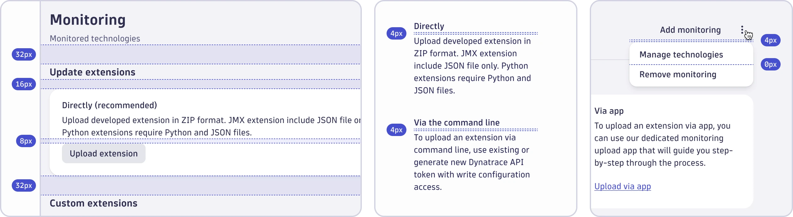
- Vertical spacing between groups of user interface elements is 32px.
- The default vertical spacing between user interface elements is 16px.
- Vertical spacing between closely related user interface elements is 8px.
- Vertical spacing between closely related text is 4px.
- Vertical spacing between user interface elements in lists is 0px.
When using a divider is present to separate content areas, use half of the spacing value before the divider and half after it. You must use our spacing tokens when applying vertical spacing.
Vertical spacing for typography
The vertical spacing between the following text styles is always 4px:


- Display and subtitle
- Heading and subtitle
- Heading and body text
For any other scenario, use the default spacing mentioned above. You must use our spacing tokens when applying vertical spacing for typography.
Horizontal spacing


- Horizontal spacing between groups of user interface elements is 32px.
- The default horizontal spacing between user interface elements is 16px.
- Horizontal spacing between closely related user interface elements is 8px.
- Horizontal spacing between closely related user interface elements in dense layouts is 4px.
You must use our spacing tokens when applying horizontal spacing.
Inset spacing
Inset spacing refers to paddings and margins that you apply to your elements.


- Inset spacing for the outermost layer of your layout is at least 48px (or 16px for dense layouts).
- Inset spacing for surfaces is 24px (or 16px for dense layouts).
- Inset spacing for containers is 16px.
- Inset spacing for fields is 12px or less, depending on the use case.
You must use our spacing tokens when applying inset spacing.
To ensure visual balance in layouts, use at least one smaller spacing token for the top or bottom inset if text borders the element's outer top or bottom bound.

