App icon helper
- Reference
- 4 minutes
The app icon may be the first thing users notice about your app. It should communicate your app's unique purpose and personality, as well as its high quality.
Use the following files to create and upload an app icon that will look great everywhere it appears in Dynatrace:
Technical requirements
Follow these requirements to display your icon in the best quality:
- Format: PNG
- Color profile: sRGB
- Size: min. 256x256px
- Recommended icon file size: ~30 KB
- Bundle size limit: 100 KB (a bundle consists of code and all used assets)
Working with the background
Use the icon background to ensure good visibility on all screens. The background ensures proper contrast for your icon in both dark and light modes.
Don't use a white app icon. It won't be visible on the background.
Working with the grid
The grid provides key shapes to help you properly align and position your app icon. The size of the grid is 256x256 pixels, which is the maximum size for app icons in Dynatrace.
Create a file using your preferred design tool and place the grid directly over the background. The background already includes the required padding (invisible frame), so you only need to position your icon using a key shape, as described in the next section.
Remember to remove the grid before you upload your finished app icon.
Working with the key shapes
The four key shapes within the grid will help you find the right size and position for your icon. Place your icon in the key shape that fits best. Position your icon as closely as possible to the outlines.
| Circular | Square | Rectangle horizontal | Rectangle vertical |
|---|---|---|---|
 | 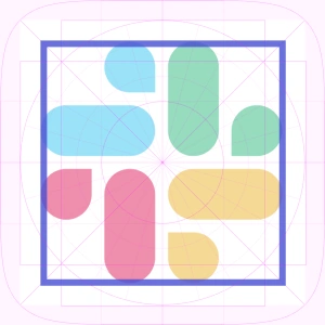 |  |  |
Step-by-step guide
- Download these PNG files:
- Position your icon on the app background. Mind the padding and don't use a white-colored icon.
- Use the key shapes to ensure proper alignment, size, and spacing.
- Remove the grid before exporting the app icon.
- Save the app icon in PNG format, with a minimum size of 256x256px and color profile sRGB.
- The finished app icon should include the invisible frame (padding) around the app background.
- Ensure the icon file size is ~30kb.
If you follow the steps, the file size should already be ~30 KB. If it isn't, you can use an online tool or Photoshop to compress the file size to ~30 KB.
Add the icon to your app
To add the app icon to your app:
- Add the icon file to your project.
- Configure it using the
iconproperty in your app configuration file.
- app.config.json
- app.config.ts
{
  "environmentUrl": "<Your-Environment-URL>",
  "app": {
    "id": "<Your-App-ID>",
    "name": "<Your-App-Name>",
    "version": "0.0.0",
    "description": "<Your-App-Description>",
    "scopes": []
  },
  "icon": "<Your-Icon-Path>"
}
import type { CliOptions } from 'dt-app';

const config: CliOptions = {
  environmentUrl: '<Your-Environment-URL>',
  app: {
    id: '<Your-App-ID>',
    name: '<Your-App-Name>',
    version: '0.0.0',
    description: '<Your-App-Description>',
    scopes: []
  },
  icon: '<Your-Icon-Path>'
}

module.exports = config;
See the different options for configuring your app in Dynatrace App Toolkit.